This Documentation is used for Classy – Minimal Multipurpose Shopify Theme.

- In the theme editor (Customize).
- Locate Banner Image Card.
- Make necessary changes > Save.
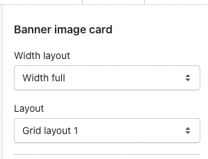
1. Banner Image Card Settings
This Documentation is used for Classy – Minimal Multipurpose Shopify Theme.
- Select width type, layout.
- Set margin top and margin bottom on desktop, tablet & mobile.

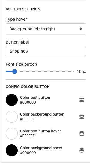
2. Banner Block
This Documentation is used for Classy – Minimal Multipurpose Shopify Theme.
- Merchant can add more banner blocks and arrange them.
- Select content position, alignment, image, color title & color background title.

- Select hover type, button label.
- Set font size button.
- Select color for text button, background button, text button hover & background button hover.
- Grid layout 1: You should use 1 block and image size: 1920 x 640 px – Or use 2 blocks with image size: 960 x 199 px.
- Grid layout 2: You should use 2 blocks and image size: 630 x 370 px. – Or use 3 blocks with image size: 820 x 820 px.
- Grid layout 3: You should use 5 blocks. You should use images that have sizes: The first, third, forth, fifth: 640 x 320px – The second: 640 x 640 px.
- Grid layout 4: You should use 4 blocks. You should use images that have sizes: The first: 960 x 640 px – The second: 450 x 306 px – The third: 450 x 305 px – The forth: 930 x 307 px.
- Grid layout 5: You should use 4 blocks. You should use images that have sizes: The first: 630 x 630 px – The second: 300 x 630 px – The third and the forth: 300 x 300 px.
- Grid layout 6: You should use 5 blocks. You should use images that have sizes: The first: 300 x 300 px – The second: 630 x 630 px – The third: 300 x 300 px – The forth: 300 x 300 px – The fifth: 300 x 300 px.
- Grid layout 7: You should use 4 blocks. You should use images that have sizes: The first: 630 x 450 px – The second: 630 x 320 px – The third: 630 x 320 px – The forth: 630 x 450 px.