You can edit the Breadcrumbs and Product Grid section and Add Section on the Collections page.
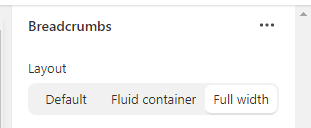
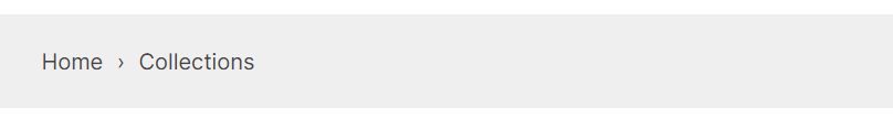
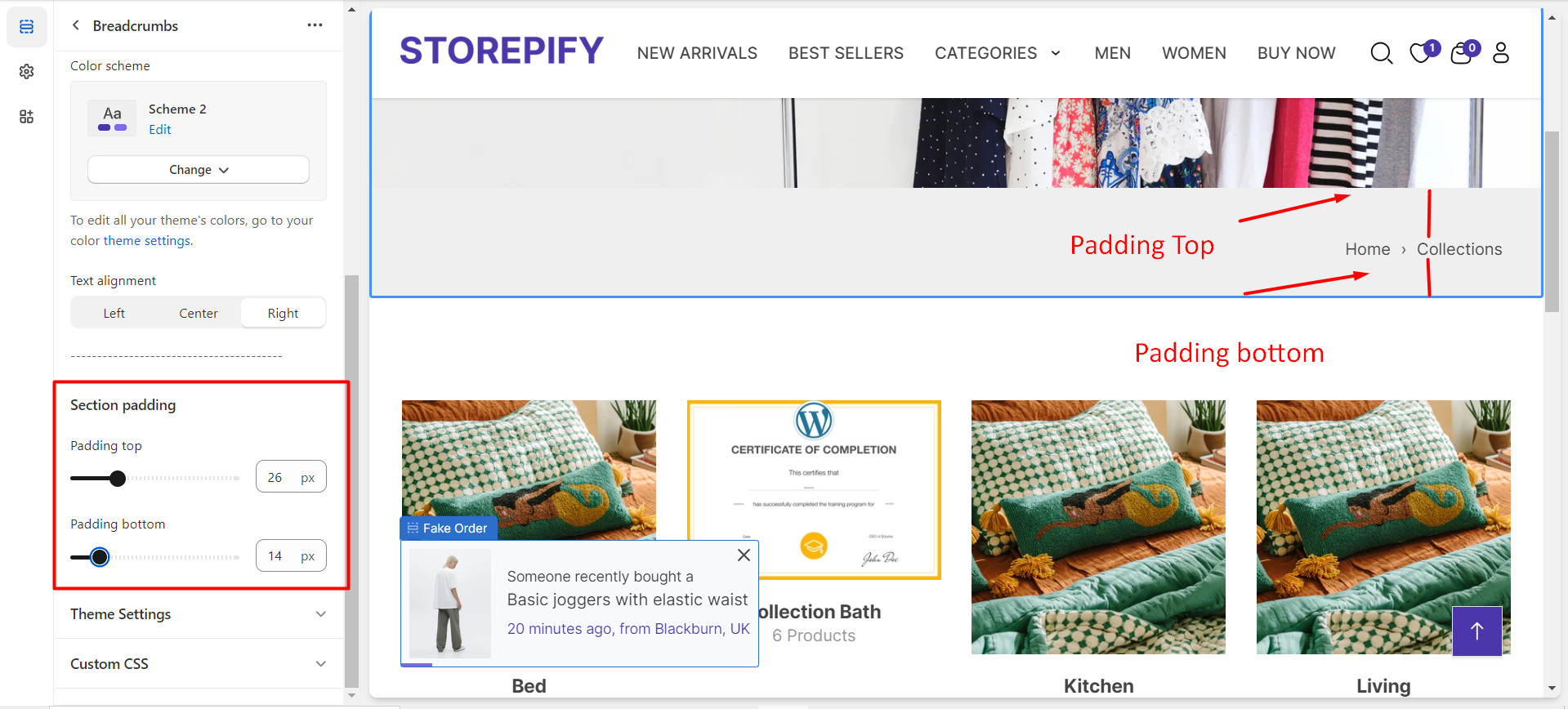
Breadcrumbs
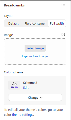
Layout
You can pick one of the 3 layout types: default, built container, or full width.
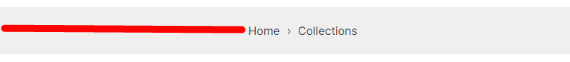
Default:
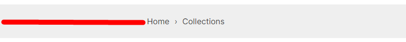
Fuild container:
Full width:
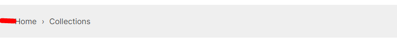
Image: You can insert an image before the breadcrumb section.
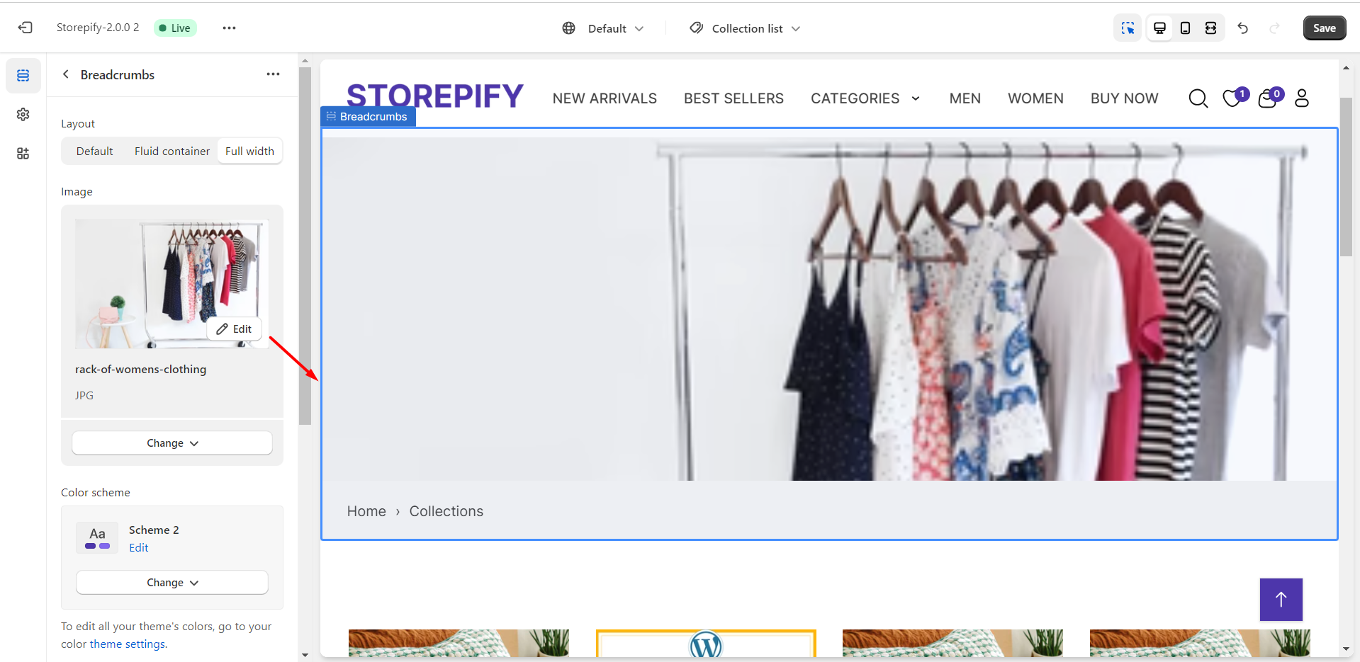
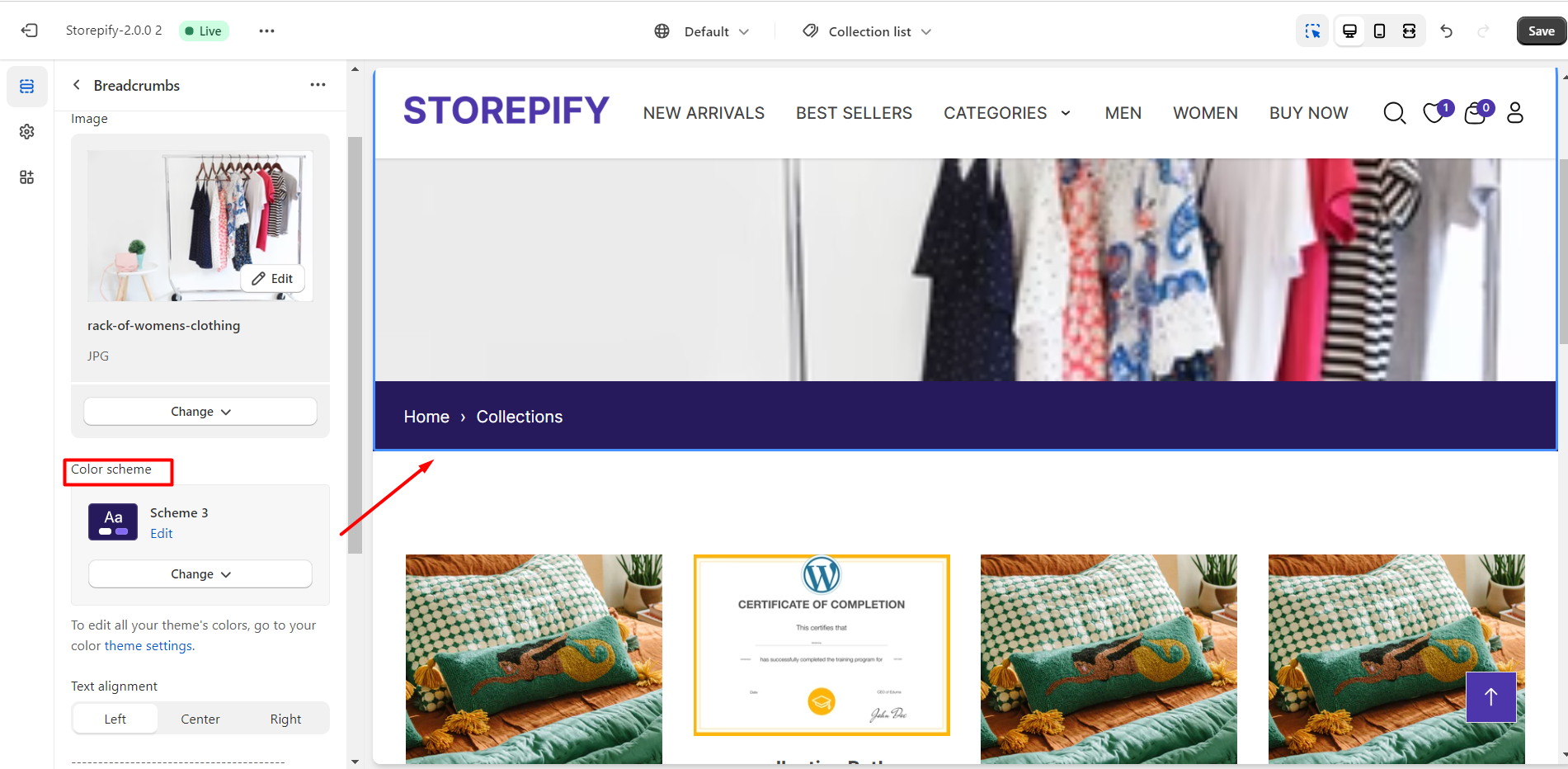
Color scheme: You can edit the color of the breadcrumb here.
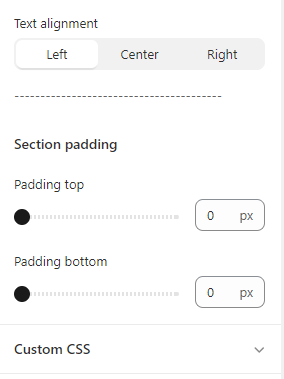
Text alignment
There are 3 text alignment types you can choose from: left, center, and right.
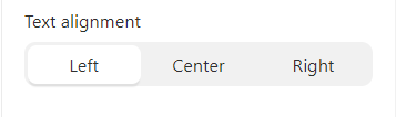
Left
Center

Right

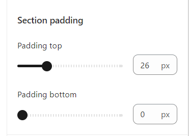
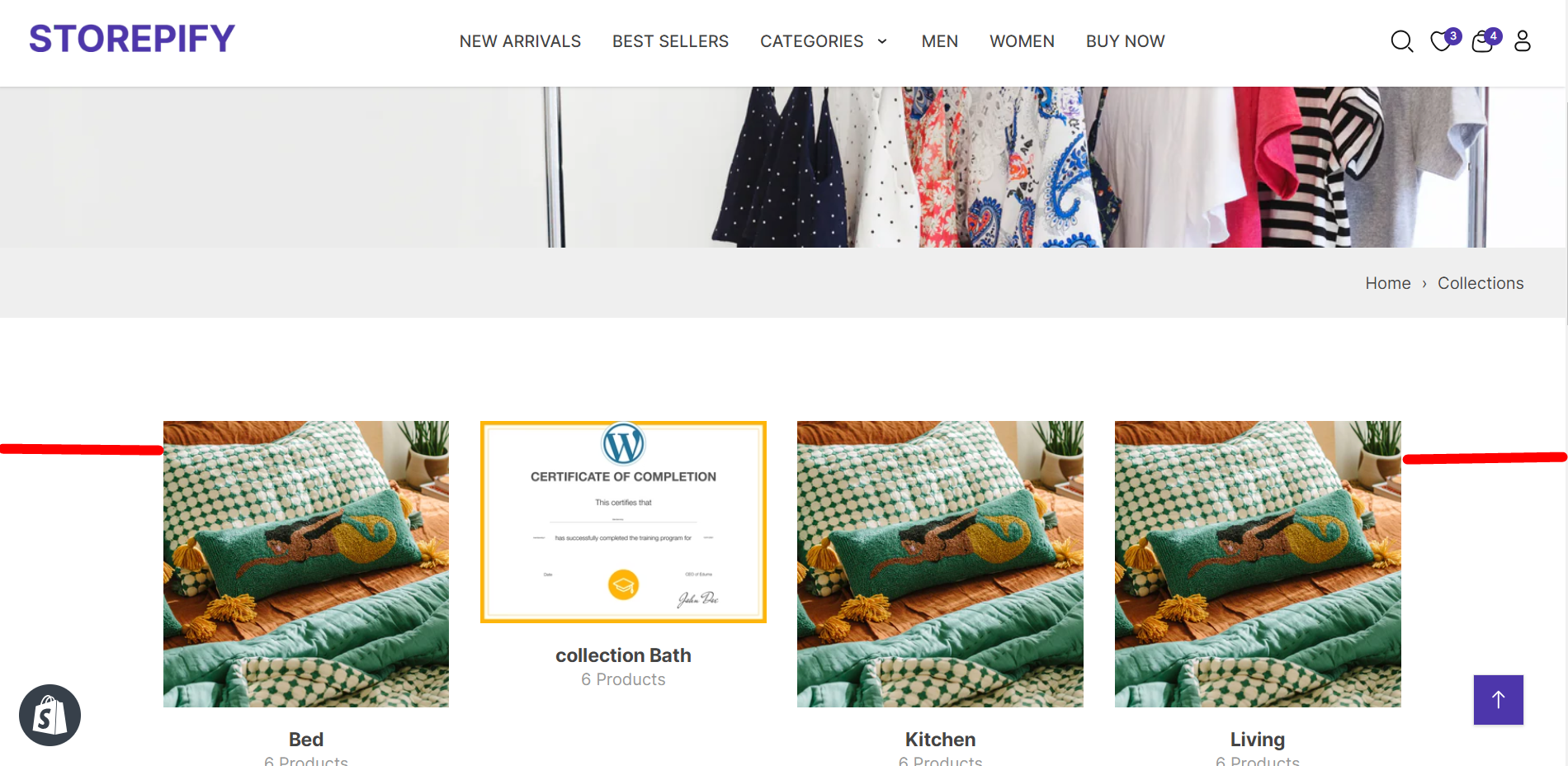
Section padding: Adjust the spacing of the breadcrumb text from the top and bottom margins.
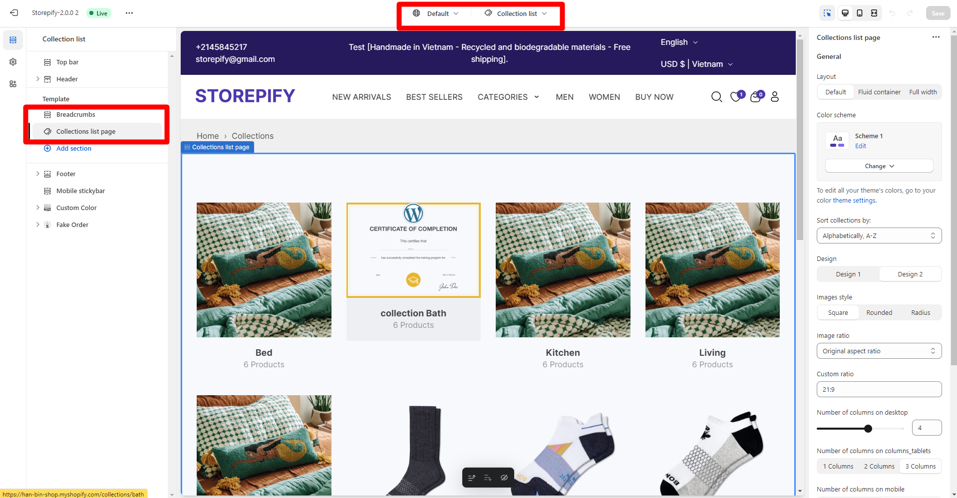
Collections list page


Layout
There are 3 layout types you can choose from: default, fuild container, and full width.
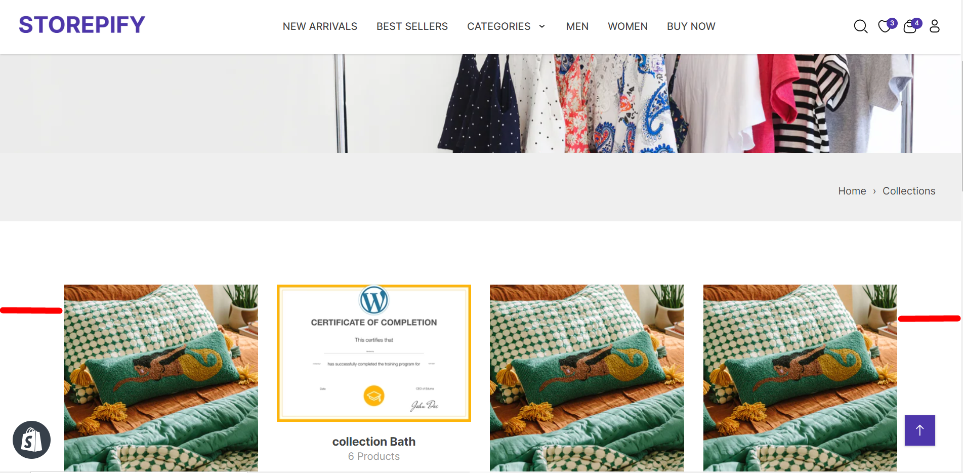
Default:
Fuild container:
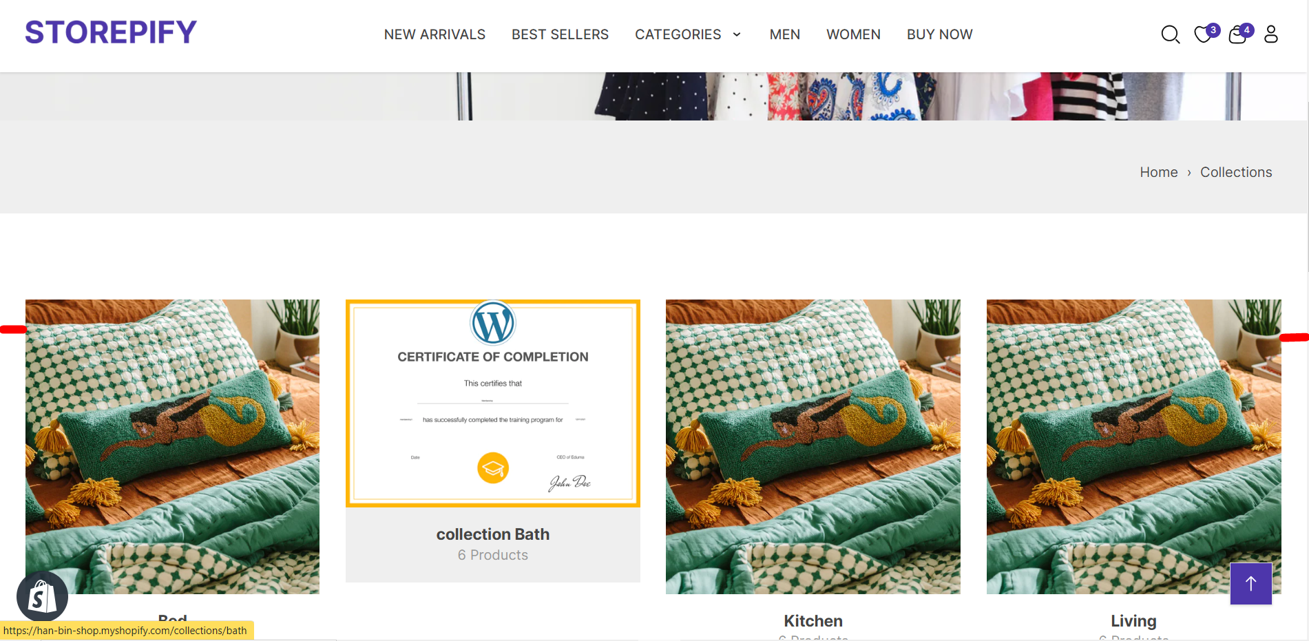
Full width:
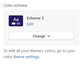
Color scheme: Choose a color scheme for the collection list.
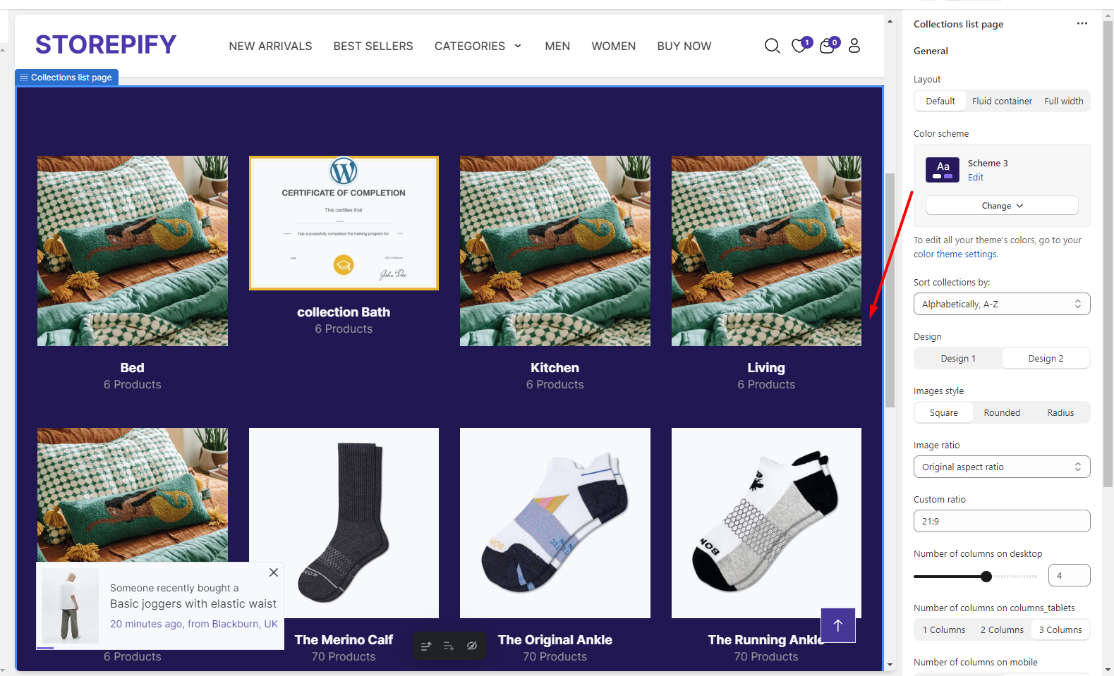
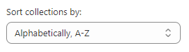
Sort collections by: Here you can choose to sort alphabetically, by date, and by product count.
Design: There are 2 designs for you to choose from.
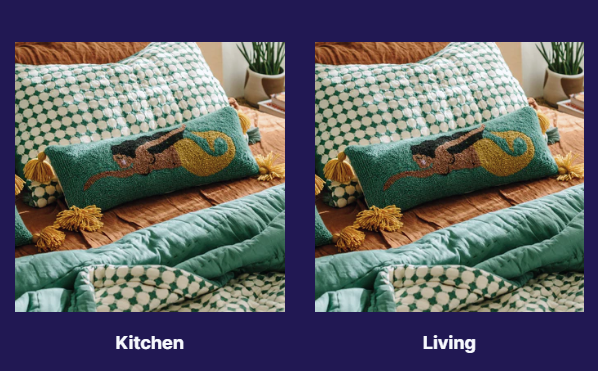
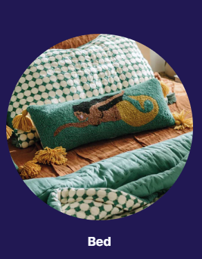
Design 1: Show only title collection.
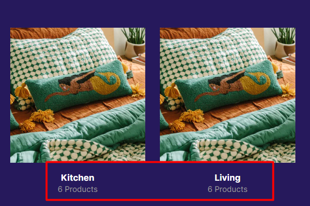
Design 2: Displays the collection title and the number of products in the collection.
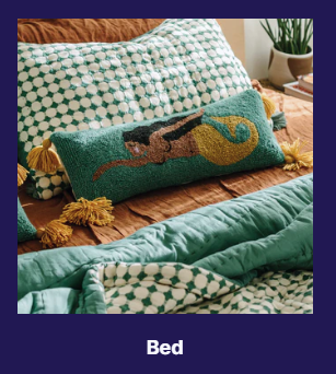
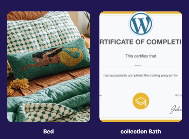
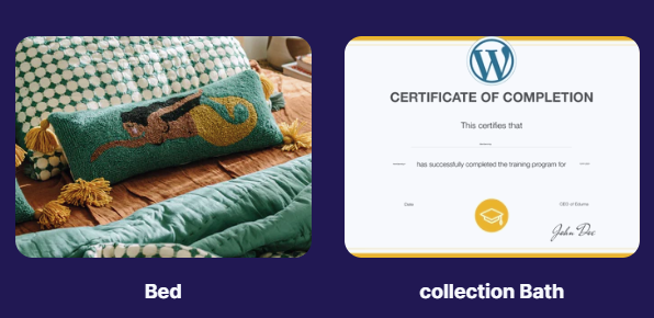
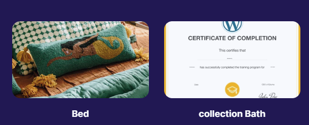
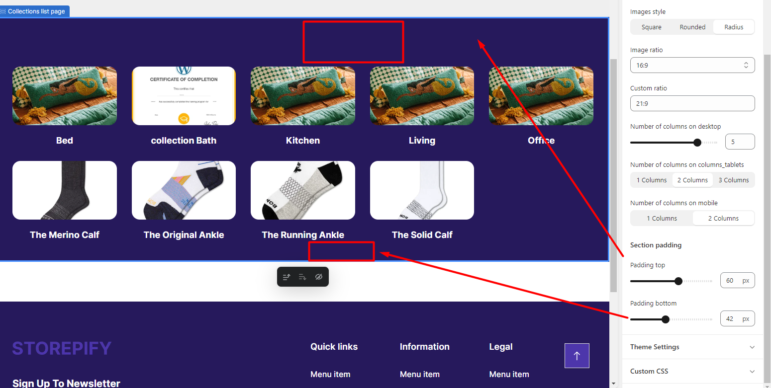
Images style: There are 3 types of collection image display: square, rounded, and radius.
Square:
rounded:
radius:
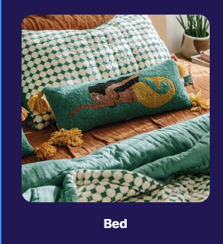
Image ratio: You can set the image aspect ratio for the collection.
Original aspect ratio
1:1
3:4
4:3
16:9
Or custom ratio
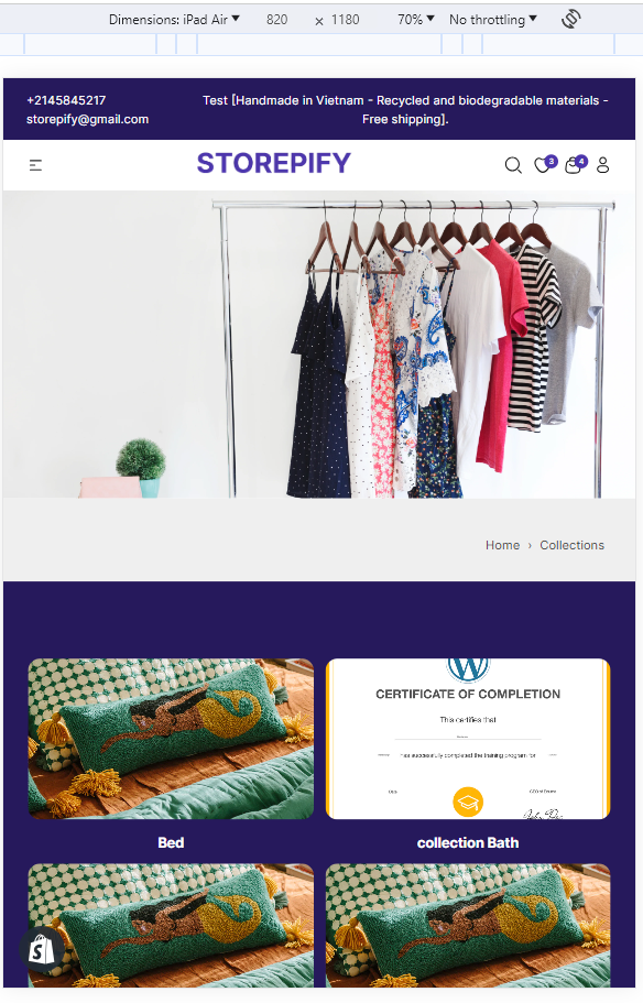
Number of columns on desktop: The numbers of the collections are shown in a single row.
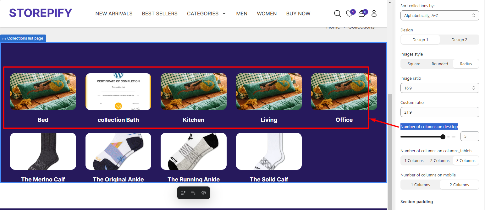
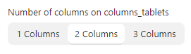
The amount of columns to display on columns_tablets.
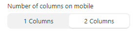
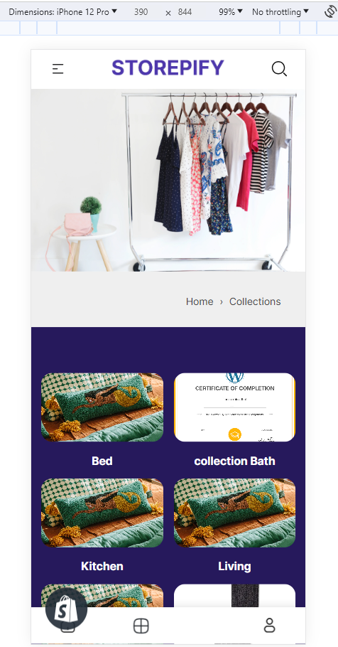
The amount of columns that show up on mobile screens.
Section padding: You have the ability to adjust the distance for both the top and bottom padding, either increasing or decreasing it as needed.
Add Section
You can add new sections to the collection list page.
Right next to it you can preview what you want to add.
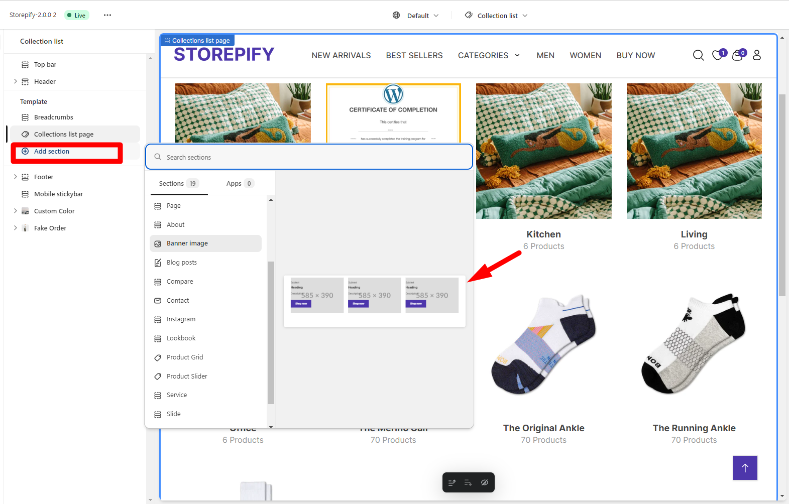
For example, if you want to add a banner image, just click on the banner image.
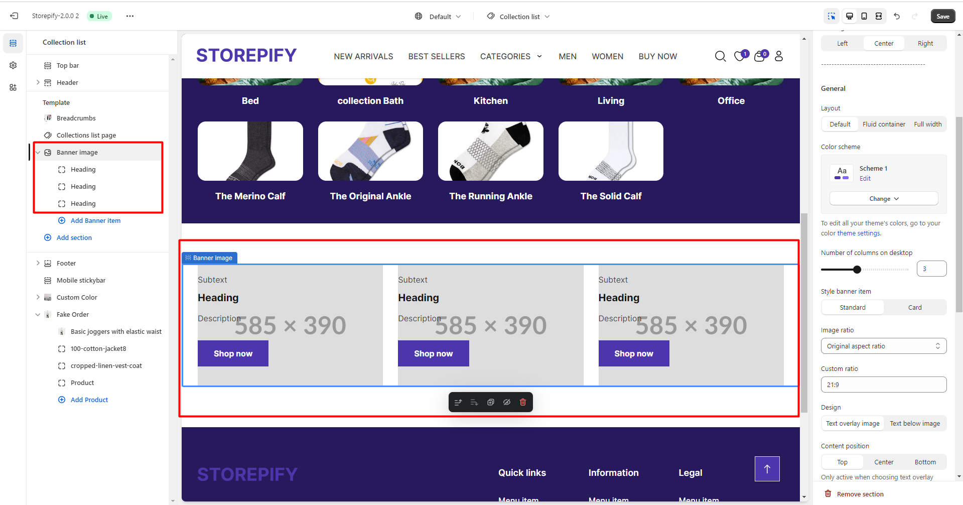
See edits here.