SquareRoot is built with powerful shortcodes that allow you to customize your page content in various way quickly and easily.
Moreover, SquareRoot Shortcode Generator will help you forming shortcode blocks for any thing you will need, so you can use them as elements to construct your SquareRoot website without touching the fuzzy code lines. Almost every element you see on our demo is a shortcode that you can insert on any page. Some of these shortcodes have numerous options for customization too, so the options you can choose from is really endless.
When you edit a post or a page, click on Shortcodes button above the content editor and the Shortcode Menu will show up.
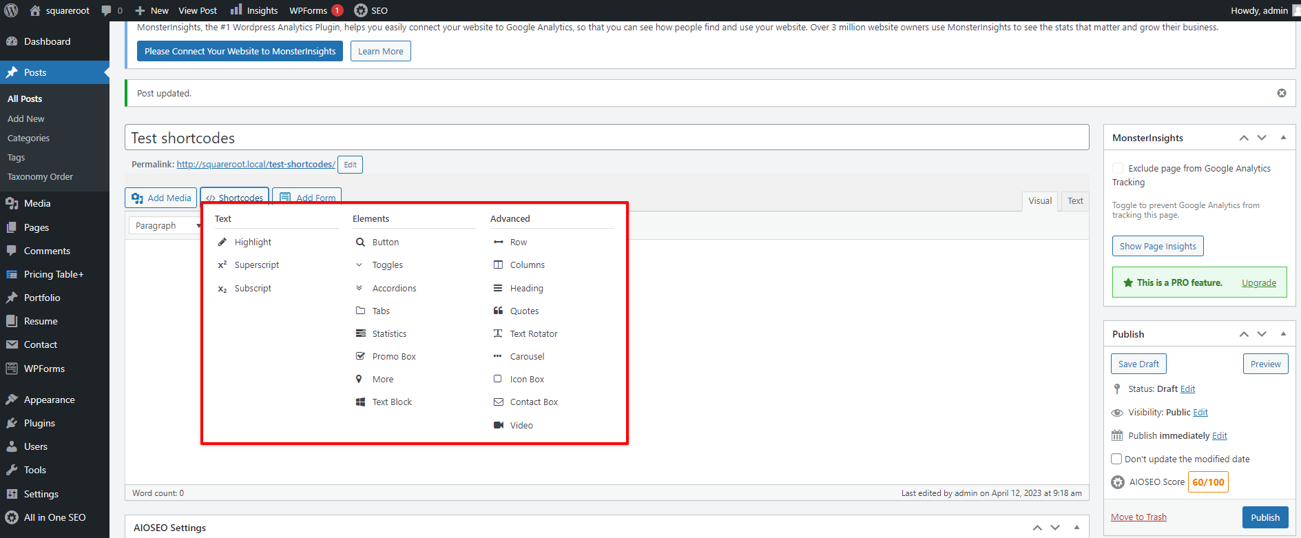
You can find the list of shortcodes SquareRoot provides as well as their setting options below:
Superscript
Simply choose a text and select superscript, the text will be displaylike this. There’s no configuration for this.
Subscript
Simply choose a text and select subscript, the text will be displaylike this. There’s no configuration for this.
Highlight
This shortcode will highlight any text in post content.
Attributes
- :
Background Color: Presetted Background color for the highlighted text. If none is chosen, the default color yellow will be used.Custom Background Color: If you don’t like any color from the predefined set, you can specify your custom background color here.
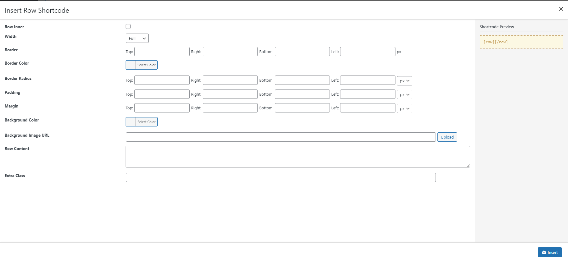
Row
With SquareRoot Row is the elements that you can use like elements blocks to build your page. It will help you take care of most content block styling work quickly an efficiently.
Attributes
- :
Inner: Check this box if your Row is placed inside another RowWidth: Set your Row widthFullorBoxedBorder: To line your Row with a decorative border, you need to define border size here. Border can be set separately for each side:Top,Right,Left, orRight.Border Color: Pick a color for your decorative border.Border Radius: A Border Radius allows you to add rounded borders to elements. SquareRoot can help you generate different border radius for each corner. You can even give your Rows a round, circle, or ellipse shape with this option.Padding: Add padding spaces to 4 sides of the row. Different values can be set for each side.Margin: Add margin spaces to 4 sides of the row. Different values can be set for each side.Background Color: Pick a solid color to highlight your Row.Background Image URL: You can also decorate your Row with a custom background image by pasting the image URL here, or Upload it to your WordPress server using WordPress Media Upload.
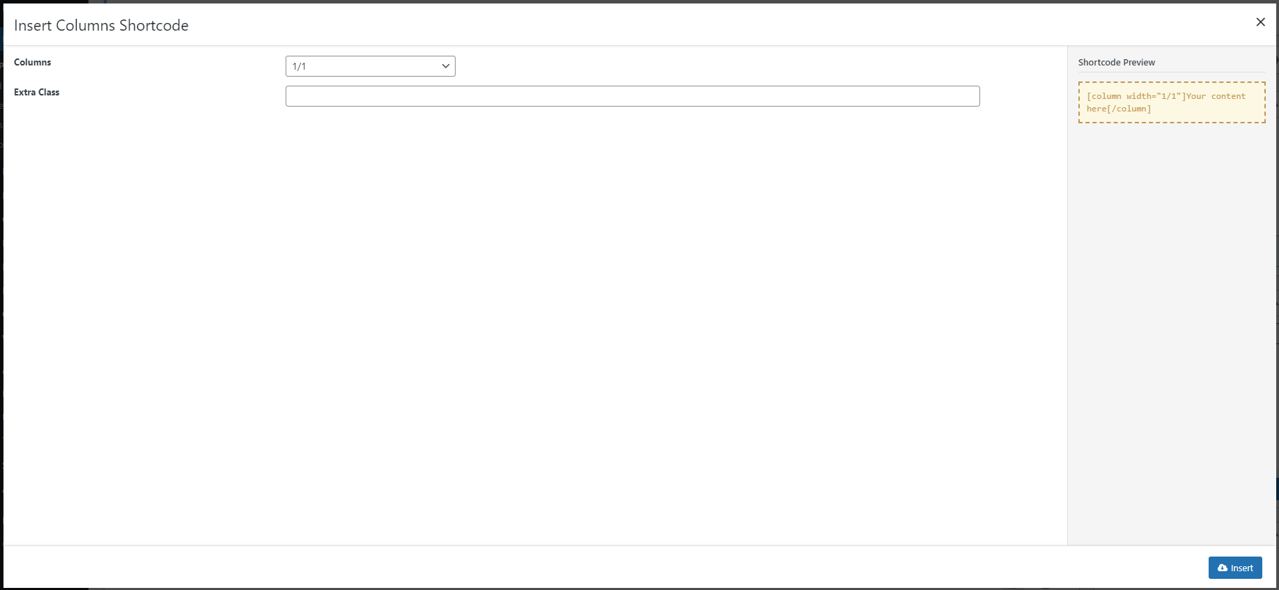
Column
Columns will divide the layout of your Row into blocks. SquareRoot Columns are built based on Bootstrap 12-grid columns system.
Attributes
- :
Columns: Number of Columns as well as a layout of this combination.Extra Class: Add Extra Class to your row if you want to refer to it in your Custom Css.
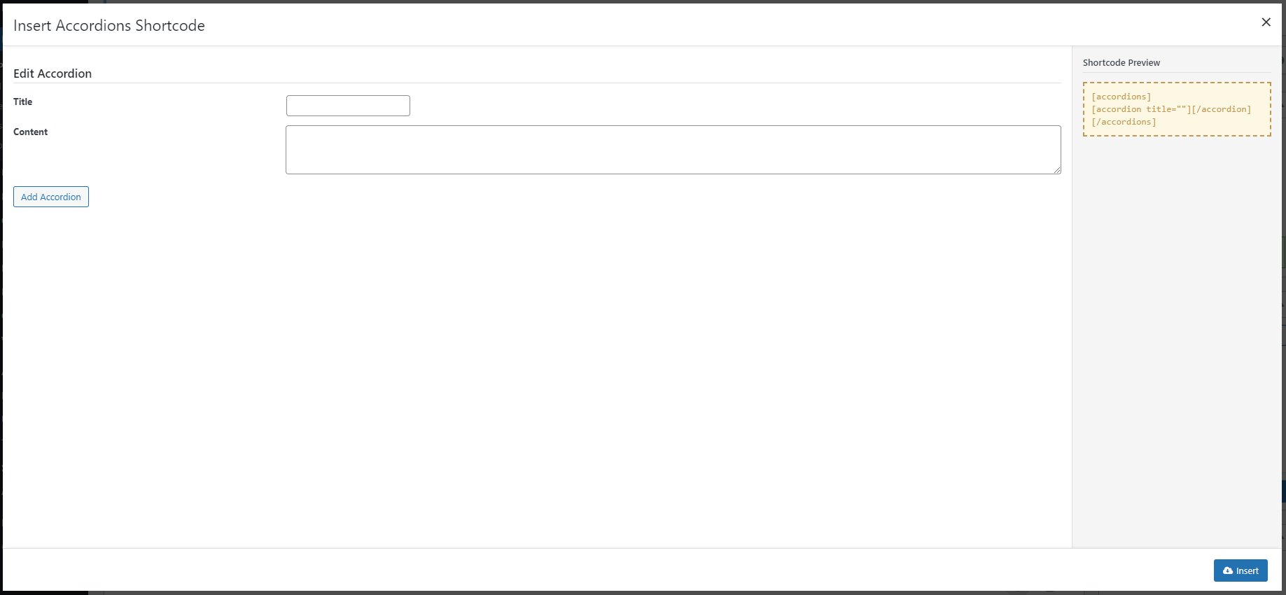
Accordions
These shortcodes will display a set of content panel which you can hide/show when clicking on the panel title. When a panel is opened, the others will be closed.
This is a combination of 2 shortcodes: [accordions] and [accordion]. [accordions] is a wrapperand doesn’t have any attribute, while [accordion] is the code that actually show the content.
Attributes
- :
Title: Title of the panel.
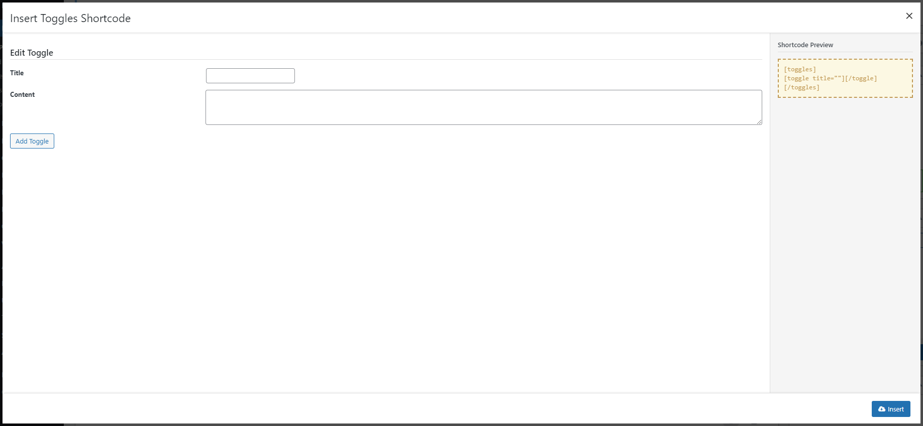
Toggle
These shortcodes will display a set of content panels you can hide/show by clicking on the panel title.
This is a combination of 2 shortcodes: [toggles] and [toggle]. [toggles] is a wrapperand doesn’t have any attribute, while [toggle] is the code that actually show the content.
Attributes
- :
Title: Title of the panel.
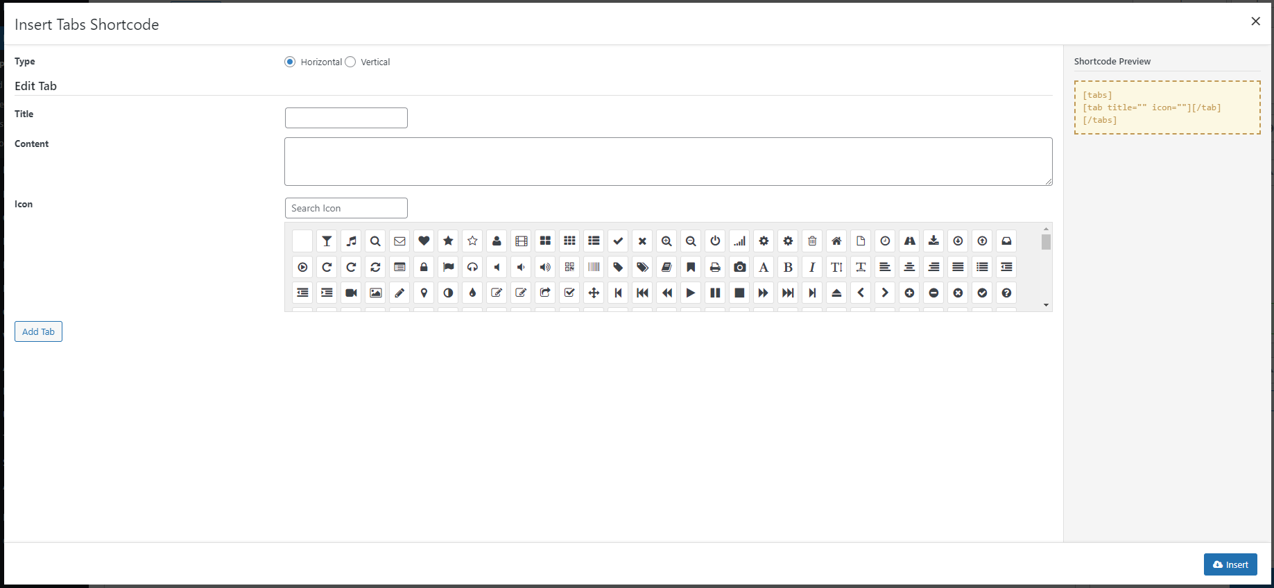
Tab
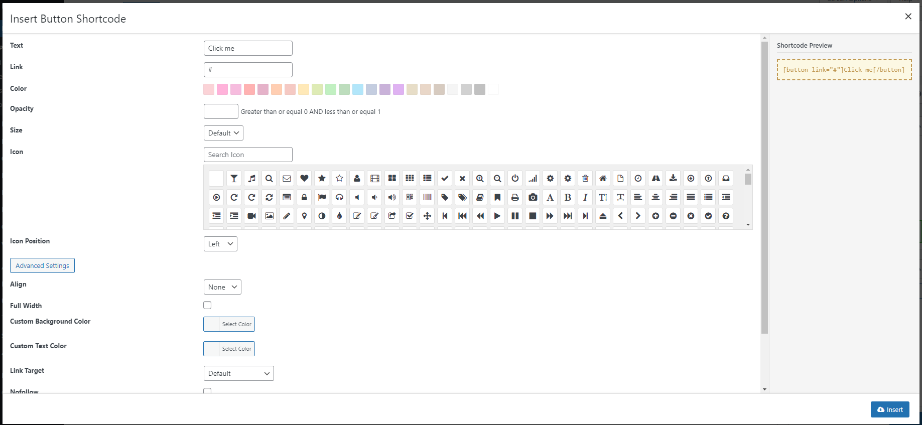
Buttons
This shortcode will placed beautiful, advanced buttons on your page.
Attributes
- :
Link: button URL.Color: button color you can choose from presetted values (see screenshot below).Opacity: create a trendy translucent button by setting an opacity to Button Background.Size: button size, can be small, medium (default) or large.Icon: button icon. Select from Font Awesome icons (see screenshot below).Icon Position: icon position, can be left (default) or right.Align: you want to float the button to theleft,right,centerornone(default)?Full Width: display the button in full width or not. Default is no.Custom Background Color: choose a custom background color for your button here with the color picker if you don’t want to use the Presetted Button Colors.Custom Text Color: custom text color for button.Link Target: default is empty. Decides if link will be openned same the same window in new window.Nofollow: set link as nofollowed if checked. By default it is not checked.Id: button ID, in case you want a custom HTML ID attribute for the button. It is useful when you need it for CSS or Javascript.Class: button CSS, in case you want a custom HTML CSS attribute for the button. It is useful when you need it for CSS or Javascript.
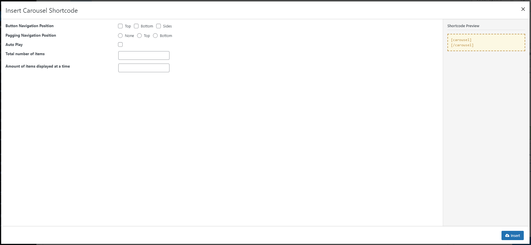
Carousel
This shortcode add a template of carousel for content blocks on your page.
These content blocks can be generated from other shortcodes like Icon box, or just HTML content.
It’s a combination of 2 shortcodes: [carousel] is a wrapper with attributes to control the display of your carousel on the page such as Navigator style or position, Auto play or Total number of items.
The second shortcode [carousel_item]is the code to hold each content block of your carousel slider.
Attributes
- :
Button Navigation Position: belongs to[carousel]. It allows you to add Navigation Button at theTop,Bottom, orSideof your carousel slideshow.Pagging Navigation Position: belongs to[carousel]. It allows you to add Pagination button at theToporBottomof your carousel slideshow.Auto Play: belongs to[carousel]. Checking this option will make your slideshow automatically play at page load.Amount of items displayed at a time: belongs to[carousel]. It defines the number of carousel items being shown on the screen at one timeTotal number of items: It define the number of[carousel_item], which is the code to hold each content block of your carousel slider.
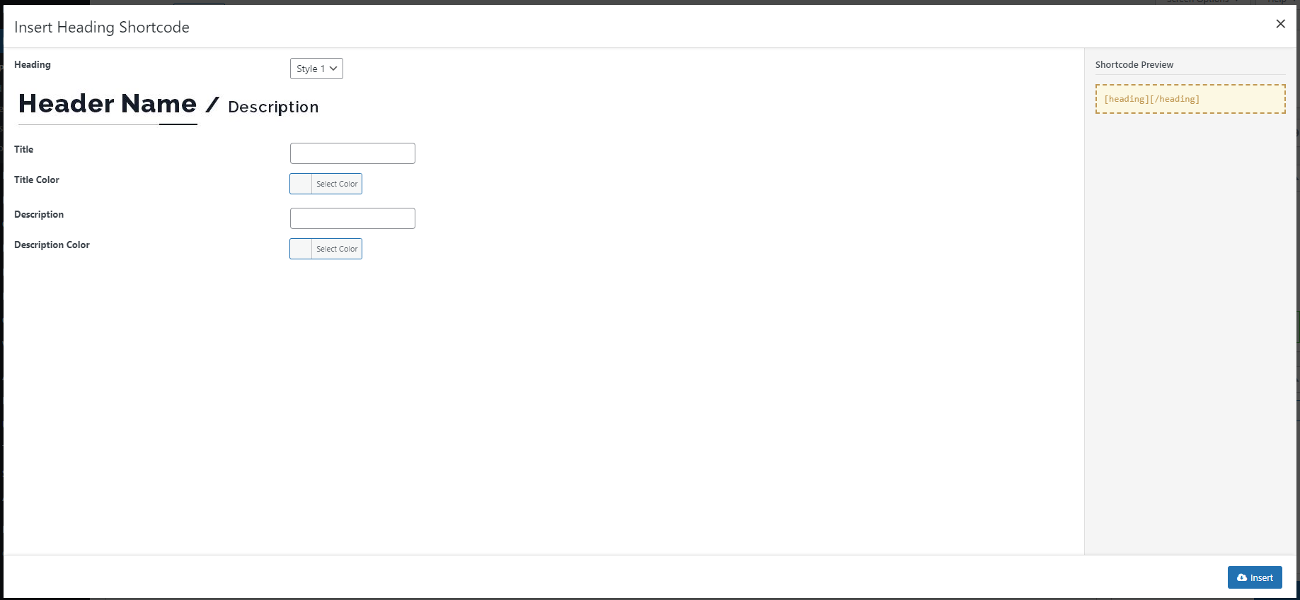
Heading
This shortcode will style the text inside it to become 5 different type of headings.
Depending on which style you’ve chosen (Style 1 and Style 4), you can add extra Description to these Headings.
Attributes
- :
Title: Heading textTitle Color: Heading text colorDescription: Only available inStyle 1andStyle 4. Description text that will be displayed in a different part of your heading.Description Color: Only available inStyle 1andStyle 4. Color of the Description text that will be displayed in a different part of your heading.
Icon Box
Icon box is a way of displaying main information in a “box” with semantic Icon, which is usually used in homepage and landing pages.
With SquareRoot, you can upload custom images to use as icon for your Icon Box too.
Attributes
- :
Title,Title Color,Title Background Color,Title Padding: Text to display as title of the Icon Box and other options to style it.Description: Content of your Icon BoxIcon Type: Choose type for your Icons. They can be icons from Font Awesome or a Custom image. In case you set it to be Custome, another option will appear to allow the uploading.Icon Position,Icon Position,Icon,Icon Size: Options for you to select and style and the icon that will be used to decorate your Icon Box.Icon Border,Icon Border Color,Icon Border Radius,Icon Effect: Options to style the Icon decoration and effect.
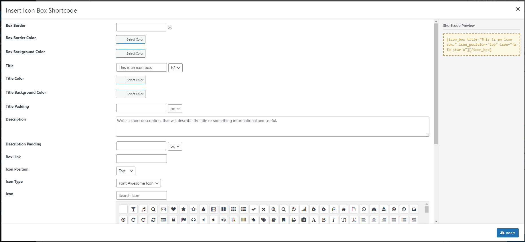
The Icon Box shortcode generator also allows you to use custom uploaded image as icon for your box.
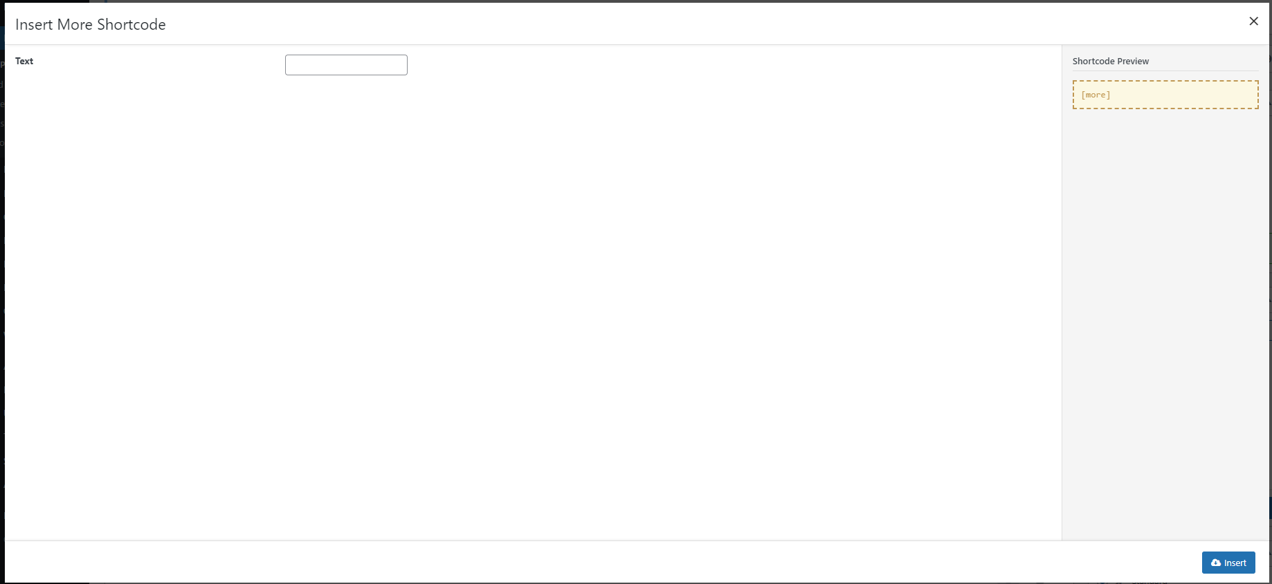
More
This shortcode will add a button that navigate visitor to the next Section when clicking
Attributes
- :
Text: Text that will be displayed with the “more” button.
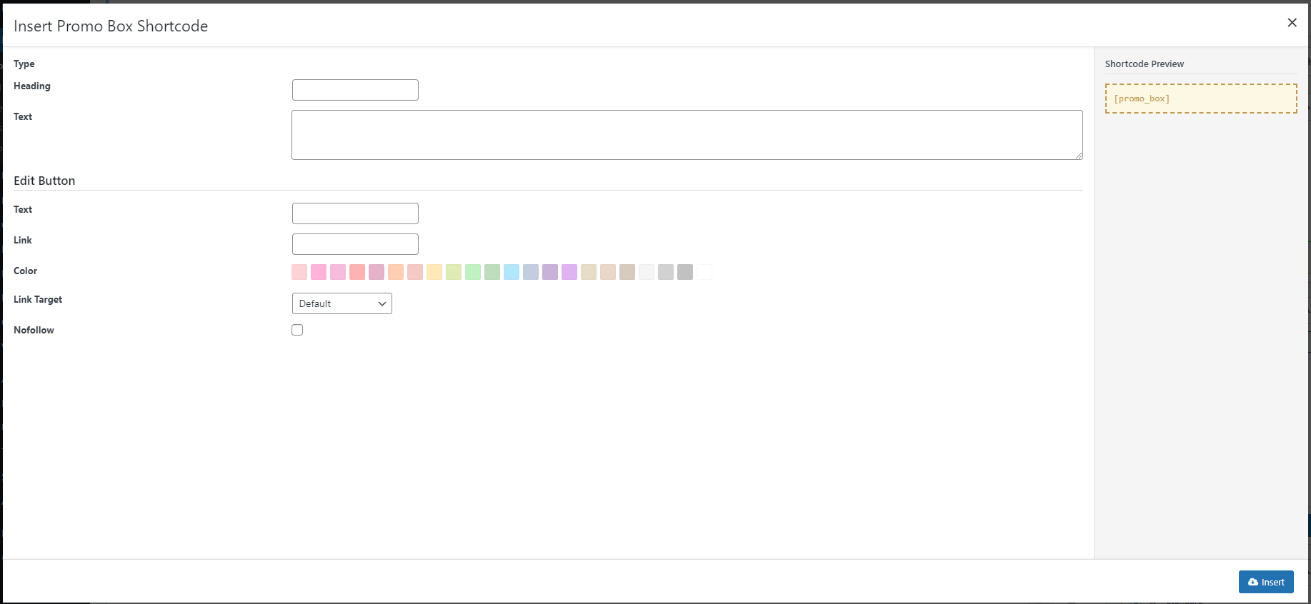
Promo Box
This shortcode will display a promotion box that helps you to get visitor attraction. It’s also called Call To Action box.
The Promo Box comes with a button on your right hand.
Attributes
- :
Heading: The Promo box heading text.Text: Content of the Promo box.Edit Button option group: IncludingColor,Link Target,Nofollow. These options are to style the button that will display with the Promo Box.
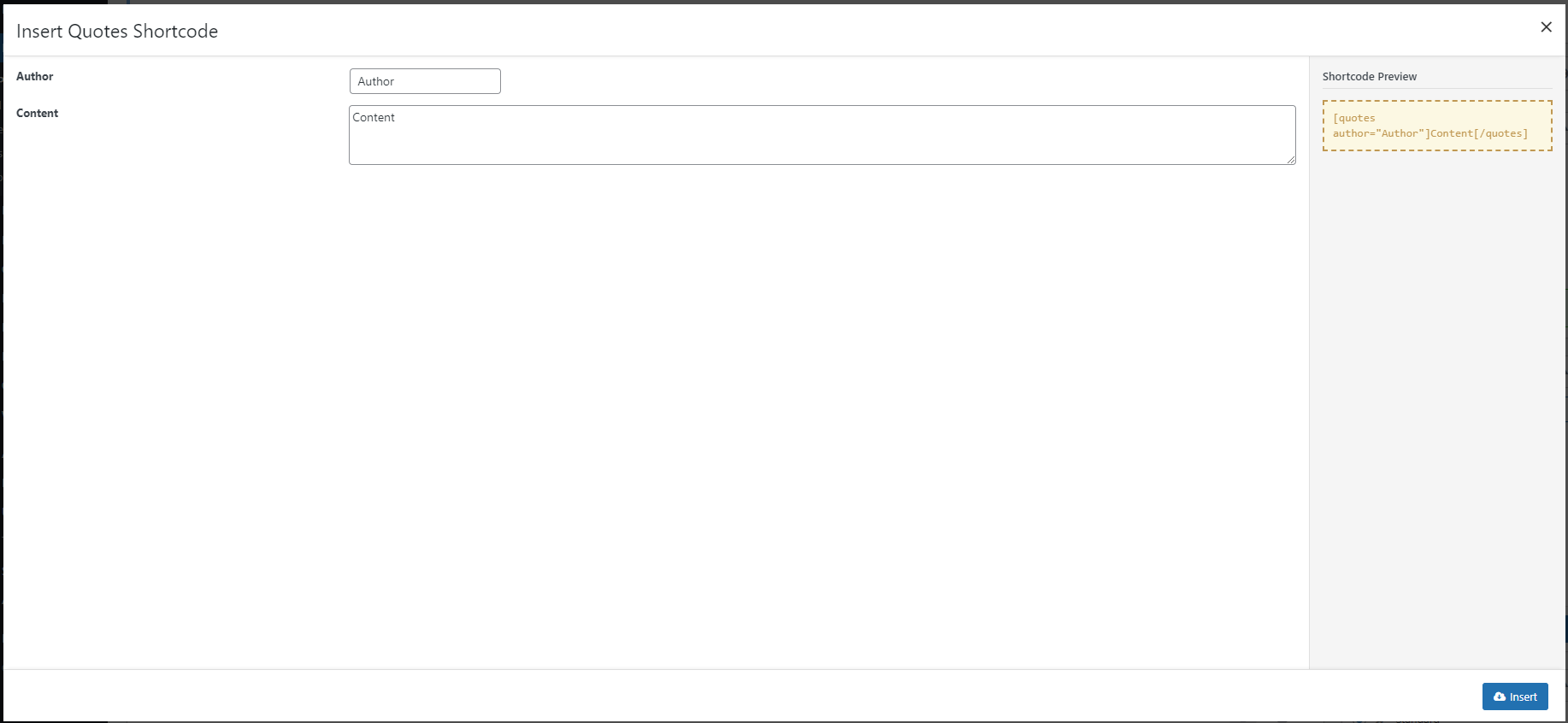
Quote
This shortcode will place a group of text with elements required for a Quote on your page.
Attributes
- :
Author: Author of the Quote.Content: Quoted Content.
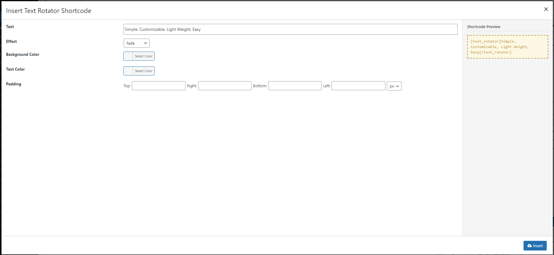
Text Rotator
This shortcode allow you to display changing text with animation on the page to catch the eyes of your visitors.
Attributes
- :
Text: Text to rotate. The Rotated words or phrases need to be separated with a comma.Effect: Select an animation effect for the rotation.Background Color: Set a background color to highlight your rotating text block.Text Color: Color of the rotating text.Padding: Add padding at the sides of your rotated text block. Different values can be set for each side.
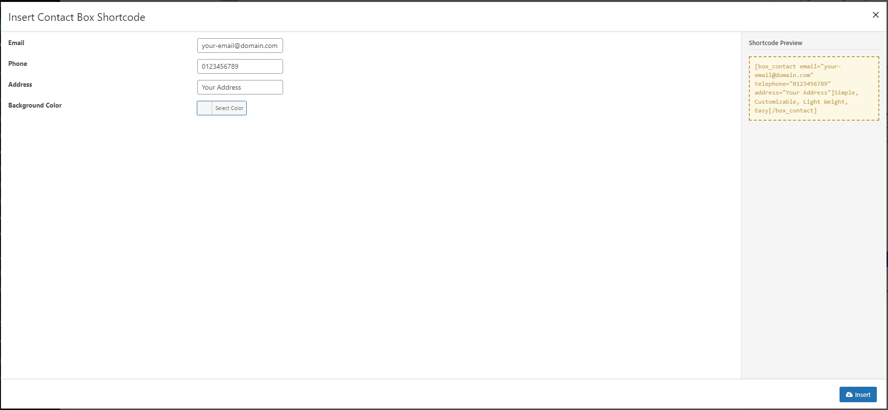
Contact
This shortcode will place a content block with your contact information on the page.
Attributes
- :
Text options: Option to insert contact information, including:Email,Phone,Address.Background Color: This option let you set a solid color as background for your Contact Block.
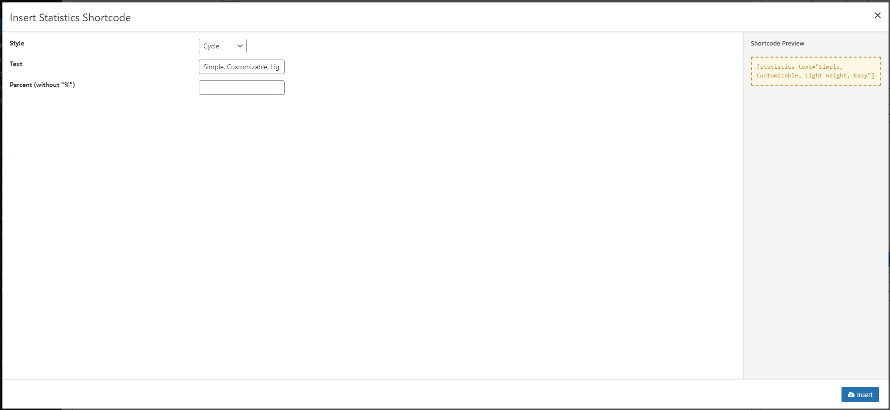
Statistics
This shortcode will display a progress bar or circle with title and percentage, and also a number value with counting animation.
Attributes
- :
Style: Style of the Progress bar or Percentage circle. For theHorizontalstyle, which would display progress bars on the page, an extraTypestyle for you to select an “Inline” or “Block” layout for your bars.Text: Text that display together with your figure or your progress chart orPercent: Percentage of the progress chart. In case you chose “Number“, it would be the figure that will be displayed on the screen.
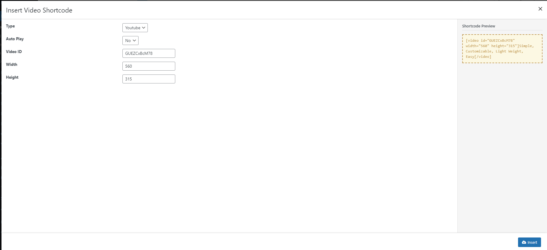
Video
Shortcode to embed a Video on your page. It will stream clips from Youtube or Vimeo.
Attributes
- :
Type: The source where your streamed video comes from. Select Youtube or Vimeo.Auto Play: Decide whether or not the Video will play at page load.Video ID: ID of the video being streamed.WidthandHeight: Size of the streaming iframe.