By clicking on the “Customize” menu under “Appearance”, you’ll be able to change all specific template settings.
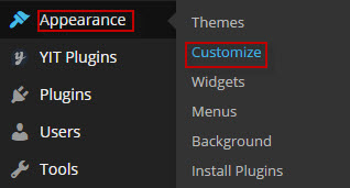
There will appear:
Please note that, after configuring something in customize, you need to click the blue button <<Save & Publish>> to apply changes.
1. Logo:
This is the section for you to set a Logo as your website identity. You can upload this Logo on your server, or just paste an URL into the Logo box.
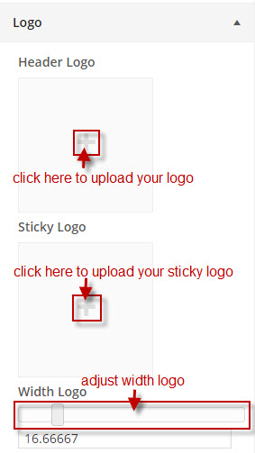
The Logo will be displayed like this on your Header and will be sticky with menu when scrolling down your site:
The size of your Logo Section on Header Menu could be set with Width Logo option. Since the layout is built using Bootstrap Grid system for a responsive design, the width of your Header Menu is also divided into 12 sections. We recommend using value 2 or 3 (corresponding with 16.67% or 25%) to menu will be shown in a line. You can set logo size as you want then your site will automatically thumbnail size depending on the value of “logo width” to logo displayed balance with menu.
Favicon:
Similarly, the image indicated by the Favicon box will be your site logo favicon, which will appear on the status bar of the browser.
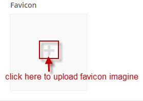
The favicon should be in one of the following formats: .ico, .png, .gif. Usually we should use .ico.
It will be shown in frontend:
2. Header Options:
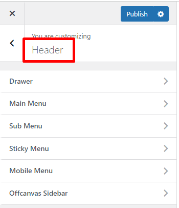
- Drawer
Note that you need to Add a Widget to show Offcanvas Sidebar. The guideline to Add a Widget will be expressed in the Widget Section bellow.
There are options to control Drawer that can be used to insert widgets at the top of your page. Note that you need to Add a Widget to show Drawer. The guideline to Add a Widget will be expressed in the Widget Section bellow.
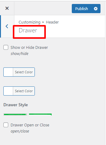
– You can choose to Show or Hide Drawer.
– Or select a Drawer Background color.
– Drawer Text Color: The text color in Drawer.
– Drawer Style: Currently there are 2 styles of Drawer Style for you to choose.
- Main Menu
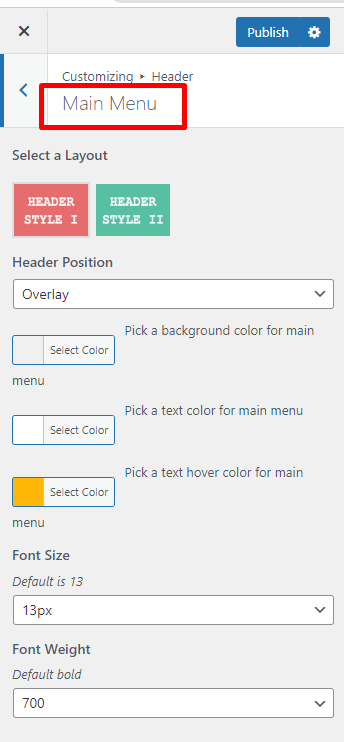
– Select a Layout: there are 2 style for header main menu.
– Header Position: select type Header Position for main menu.
– Background color: select color for background main menu.
– Text color: select color for text of main menu.
– Text Hover color: select color for text when hover over main menu.
– Font Size: select font size for text main menu.
– Font Weight: select font weight for main menu text.
- Sub Menu
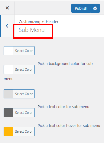
– Color Border Top: select color for border top of sub menu.
– Background Color: select color for background of sub menu.
– Color Border Bottom: select color for border bottom of sub menu.
– Text color: select color for text of sub menu.
– Text color hover: select color when hover over text sub menu.
- Sticky Menu
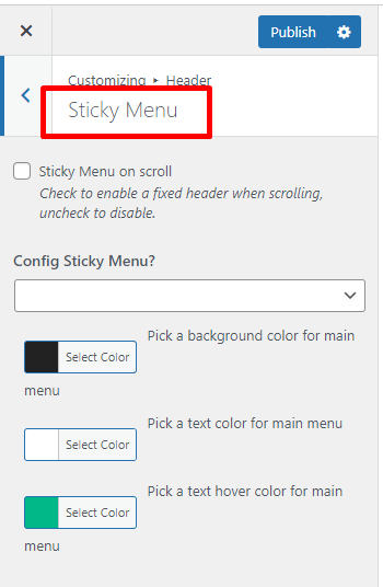
– Config Sticky Menu: you can choose “custom” or let it “same with main menu” when sticky menu.
– Sticky Background color: If custom sticky menu, select background color for main menu when sticky.
– Text color: If custom sticky menu, select text color for main menu when sticky.
– Text Hover color: If custom sticky menu, select text hover color for main menu when sticky.
- Mobile Menu
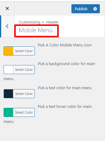
This option allows you to configure to see main menu in mobile.
– Background color: select background color for main menu when view on mobile.
– Text color: select text color for main menu when view on mobile.
– Text Hover color: select text hover color for main menu when view on mobile.
- Offcanvas Sidebar
Note that you need to Add a Widget to show Offcanvas Sidebar. The guideline to Add a Widget will be expressed in the Widget Section bellow.
There are options help control every element on Offcanvas Sidebar:

– Show or hide: Choose to show or hide Offcanvas Sidebar.
– Background color: Select Background Color for Offcanvas Sidebar.
– Text color: Text Color in offcanvas Sidebar.
– Link color: Color for link on offcanvas Sidebar.
– Icon: enter icon name.
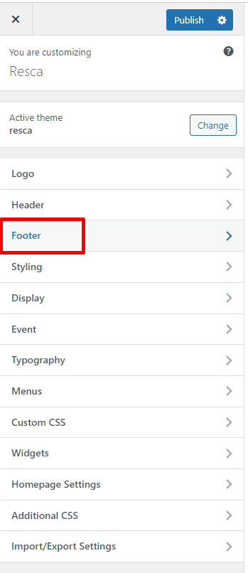
3. Footer Options
As the name indicated, it is the section to control the Footer part of your site.
- Footer:
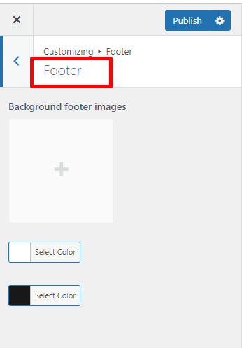
– Background footer image: upload background image for footer.
– Text Color: select color for text in footer.
– Background Color: select background color for footer.
- Copyright Options
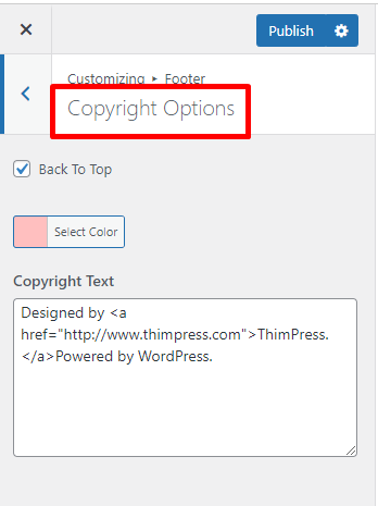
– Text Color: Select color for text in copyright.
– Copyright Text: allow you to input content for the tagline in your footer.
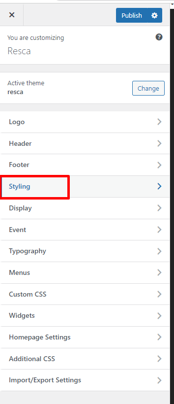
4. Styling Options
- Layout Section Option:
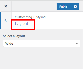
Select a layout: choose to display your site in full width, or in a boxed zone.
- Patterns Section Option:
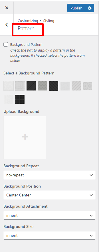
– Background Pattern: checking the box under this option title and you will be able to select one of ours.
– Upload Background: select background to upload to use as your Background Pattern.
– Background Repeat: to repeat the image in your background.
– Background Position: to set the starting position of a background image.
– Background Attachment: to set whether a background image is fixed/scroll/local/ initial or inherit with the rest of the page.
– Background Size: to specify the size of the background images.
- Background Color and Text Color
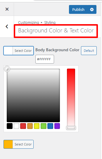
: this option should only be used with the Boxed Layout. You can select a solid color for the background of your page.
: Each of our theme will have one major color called “Theme primary color”. The elements of the primary color are included with: Hover Text color of “Book a Table”, color of “View Detail” button, color of text “Book Menu” button, hover social link icon… If you configure any color, it also will be applied similarly to these elements.
5. Display
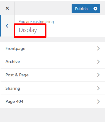
- Front Page:
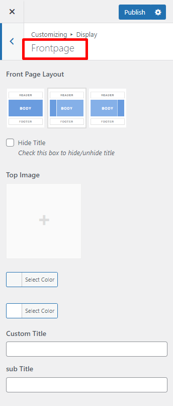
– Front Page Layout
This is the place for you to select an alignment for your frontpages, which is the first display page in your site. You can choose whether or not to use the sidebar, as well as positioning it in a layout with 1 or 2 columns.
1 – No side bar at all
2 – One sidebar, located on the left
3 – One sidebar, located on the right
– Top Image: upload top image for front page.
:
-Custom Title
– Select Layout Default
– Custom Title: enter name of Tittle front page. If leave blank field, system will automatically display name of front page.
– Background Heading: Select Background Heading color for front page.
– Select Style Default: select style default for front page.
– Select Columns: This configuration just works for style grid layout, select number columns displayed in front page.
– Text Color Heading: text color heading in Front page.
– Height Heading: adjust height heading of front page.
- Archive:
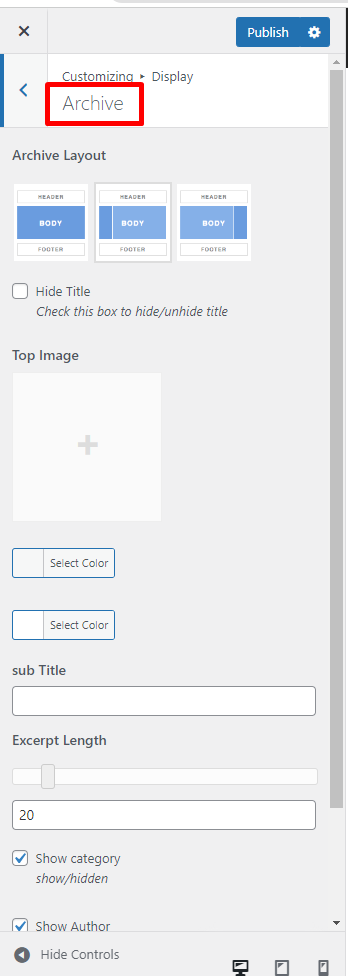
-Archive Layout
-Top Image
–
–
-Excerpt Length
- Post & Page:
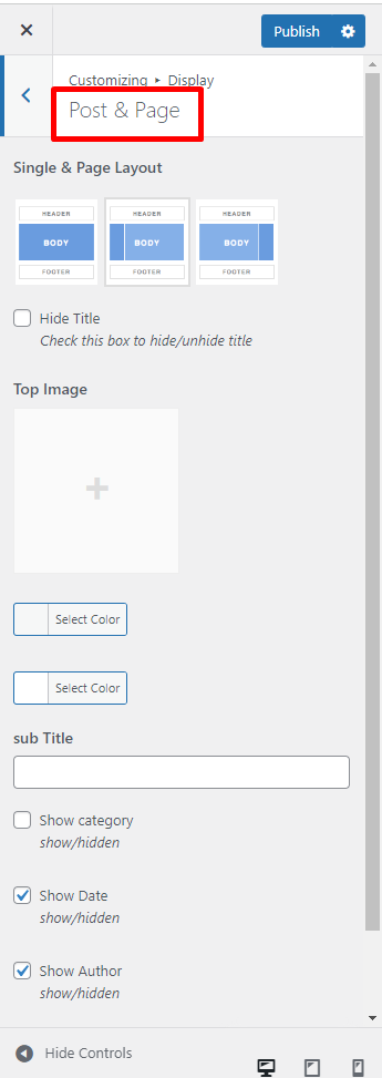
-Single & Page Layout
-Top Image
–
–
– Sub title
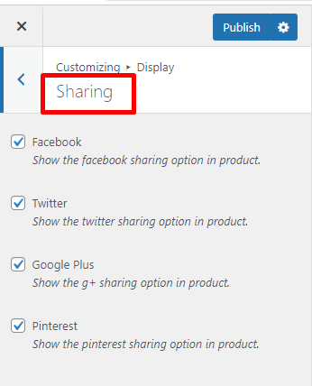
- Sharing:
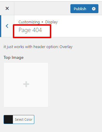
- Page 404:
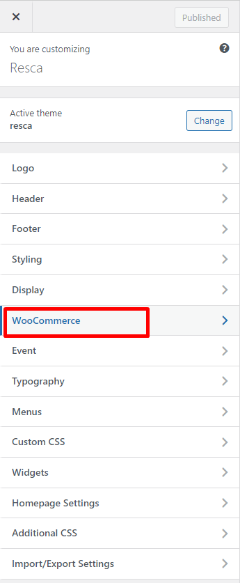
6. WooCommerce
- Category Products
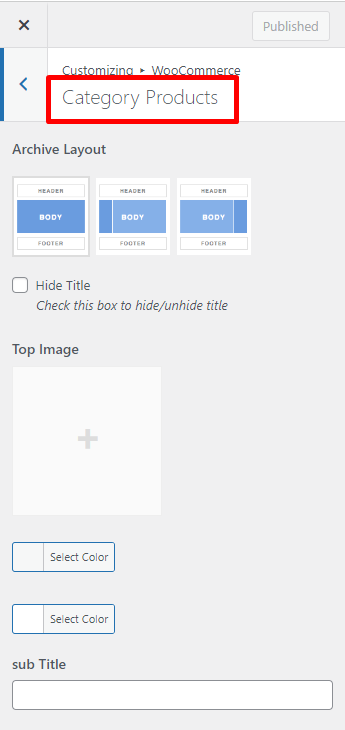
-Archive Layout
-Top Image
–
–
- Product Page
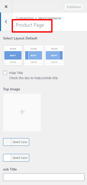
-Select Layout Default
-Top Image
–
–
- Setting:
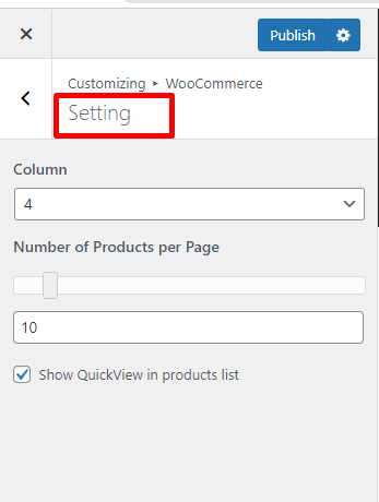
-Column
-Number of Products per Page
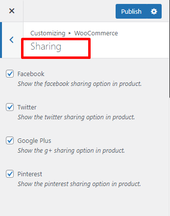
- Sharing
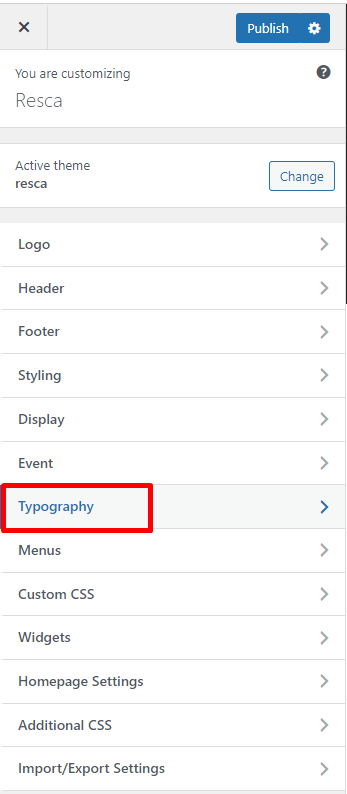
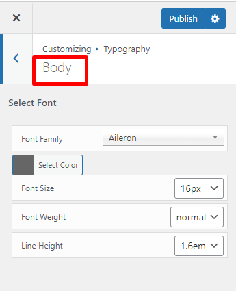
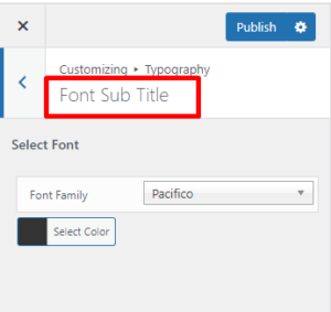
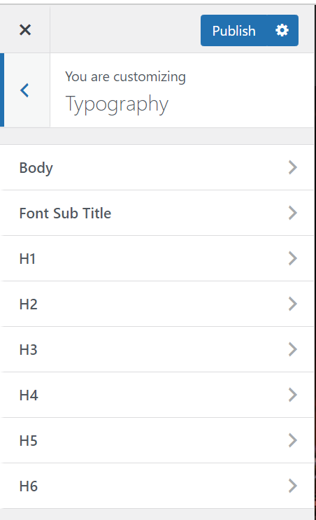
7. Typography:
- Body Section Option:
- Font Sub Title
- Heading Section Option:
From H1 to H6
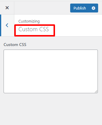
8. Custom Css:
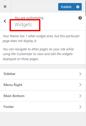
9. Widget:
10. Static Front Page:
-Front page displays
-Front page
-Posts page
11. Import/ Export Settings:
To configure options under Customize section.
If you want to have a new site with similar settings as your created site. Use this function to export a file js in created site and import this file js into the new site.