1. Overview
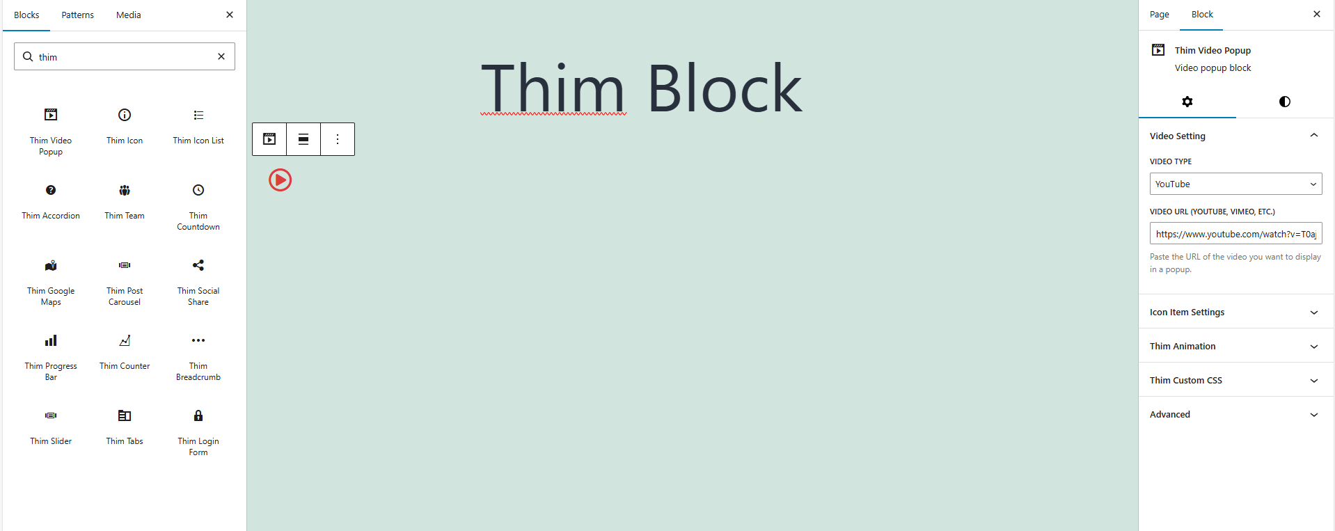
The Thim Video Popup Block allows you to display a clickable icon that opens a video in a popup (modal).
It is commonly used for video introductions, demos, testimonials, or promotional content.
Common use cases:
- Landing page video intro
- Course preview video
- Product demo
- Marketing / promo video
2. Access Block Settings
- Click on the Thim Video Popup block
- Open the Block tab in the right sidebar
- Available sections:
- Video Setting
- Icon Item Settings
- Thim Animation
- Thim Custom CSS
3. Video Setting
3.1. Video Type
Select the video platform you want to use.
Available options:
- YouTube
- Vimeo
- Other supported platforms (depending on theme)
How to use:
- Open the Video Type dropdown
- Choose the platform where your video is hosted
3.2. Video URL (YouTube, Vimeo, etc.)
Paste the full URL of the video you want to display in the popup.
Examples:
https://www.youtube.com/watch?v=xxxxhttps://vimeo.com/xxxx
Best practice:
- Use public videos
- Avoid private or restricted links
4. Icon Item Settings
This icon is the button to click to open the video popup.
4.1. Library Icon
Choose an icon from the built-in icon library.
Common choices:
- Play icon
- Circle play
- Media icons
4.2. Upload SVG
Upload a custom SVG icon to replace the default icon.
Recommended for:
- Custom play button
- Brand-specific icons
Note: Use optimized SVG files only.
4.3. Icon Preview & Remove
Shows the currently selected icon.
Click ✕ to remove or replace the icon.
5. Hiệu ứng Animation
Adds animation effects when the icon appears or when users interact with it.
Common options:
- None
- Fade In
- Zoom In
- Slide effects
Best practice:
- Use subtle animations
- Avoid distracting effects
6. Thim Custom CSS
Add custom CSS styles specifically for this video popup block.
Default structure:
Examples:
Change icon size:
Add hover effect:
7. Thim Video Popup Block – Style Options
7.1. Padding
Controls the inner spacing around the video popup icon.
How it works:
- Increases or decreases the clickable area
- Adds space between the icon and its background
Controls:
- Slider: adjust padding value
- Link icon:
- Linked → same value for all sides
- Unlinked → custom values per side
- Reset icon: reset to default
Best practices:
- Increase padding for better touch experience on mobile
- Use smaller padding when placing icon near text
7.2. Icon Styles
7.2.1. Screen Type (Responsive)
Allows you to customize icon styles for different devices:
- Desktop
- Tablet
- Mobile
How to use:
- Select a device icon
- Adjust settings for that screen only
Use cases:
- Large icon on desktop hero sections
- Smaller icon on mobile screens
7.2.2. Font Size
Controls the size of the video popup icon.
Options:
- Default (inherits theme size)
- Custom sizes (if supported)
Best practices:
- Use larger icons for CTA areas
- Keep size consistent across sections
7.2.3. Icon Color
Sets the color of the video popup icon.
Behavior:
- Applies to icon font
- Applies to SVG using
fill: currentColor
How to use:
- Click the color picker
- Select a color or clear it to use default
Tips:
- Use high-contrast colors for visibility
- Match icon color with brand color