1. Overview
The Thim Tabs Block allows you to organize content into multiple tabs, improving readability and user experience by grouping related information.
Common use cases:
- Course details (Overview / Curriculum / Instructor)
- Product information
- FAQs
- Feature comparisons
2. Block Structure
The Tabs block is composed of:
- Thim Tabs (parent block)
- Tab Item (child blocks – one per tab)
Each Tab Item represents the content of a single tab.
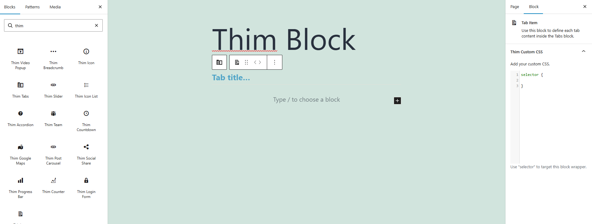
3. Thim Custom CSS (Tab Item)
The Thim Custom CSS option allows you to add CSS styles that apply only to this specific Tab Item.
Use the keyword selector to target the wrapper of the current Tab Item.
selector {
}
selectoris automatically replaced with the unique CSS selector of this block.- Ensures styles are scoped and safe.
Change tab content background
selector {
background-color: #f9f9f9;
padding: 20px;
}
Customize text style inside tab
selector p {
font-size: 16px;
line-height: 1.6;
}
Add border for tab content
selector {
border: 1px solid #eee;
border-radius: 6px;
}
Highlight a specific tab
selector {
box-shadow: 0 4px 12px rgba(0,0,0,0.08);
}