1. Overview
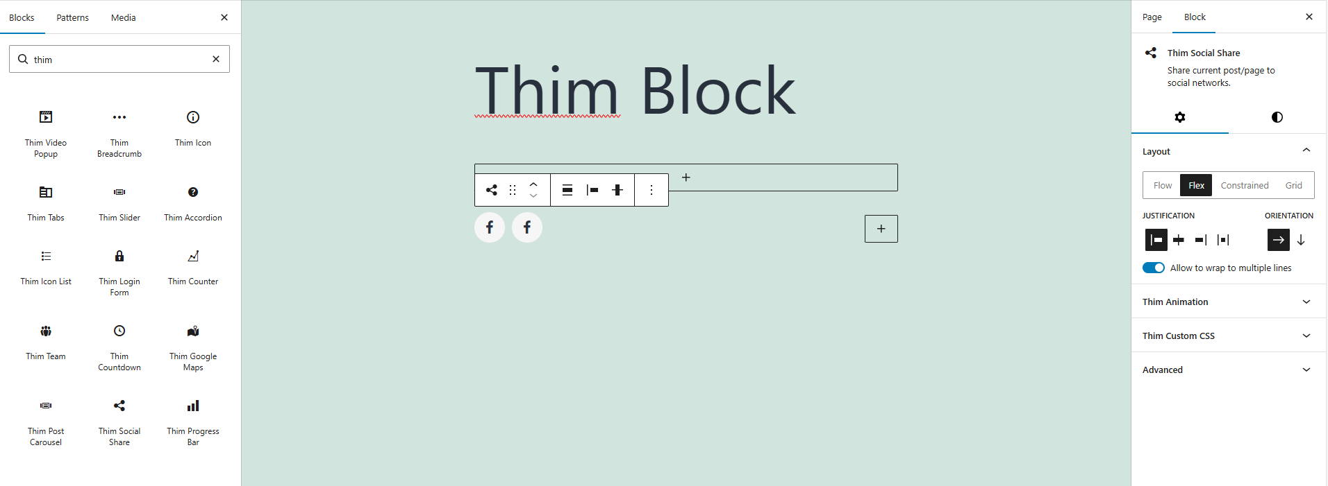
The Thim Social Share block allows you to display social sharing icons for the current post or page, helping users easily share your content across social networks.
2. Layout
Choose how social icons are arranged within the block.
Flow: Icons follow the natural document flow.
Flex: Icons are displayed using flex layout with alignment controls.
Constrained: Icons are limited to a fixed width.
Grid: Icons are displayed in a grid layout.
3. Justification
Control the horizontal alignment of social icons.
Options include left, center, right, or space-between alignment.
4. Orientation
Define the direction of the icon layout.
Horizontal: Icons are displayed in a row.
Vertical: Icons are stacked in a column.
5. Allow to Wrap to Multiple Lines
Enable this option to allow social icons to wrap onto multiple lines when there is not enough horizontal space.
6. Color
Customize the appearance of social icons.
Text: Change the icon color.
Background: Set the background color for the icons.
7. Dimensions
Adjust spacing around the social share block.
Padding: Control the inner spacing of the block on all sides.
8. Thim Animation
Apply animation effects when the block appears on the page.
Choose from available animation types or disable animation entirely.
9. Thim Custom CSS
Add custom CSS styles to further customize the appearance of the social share block.
Use the selector keyword to target this block wrapper.
10. Advanced
Configure advanced block settings such as additional CSS classes or visibility options.