1. Overview
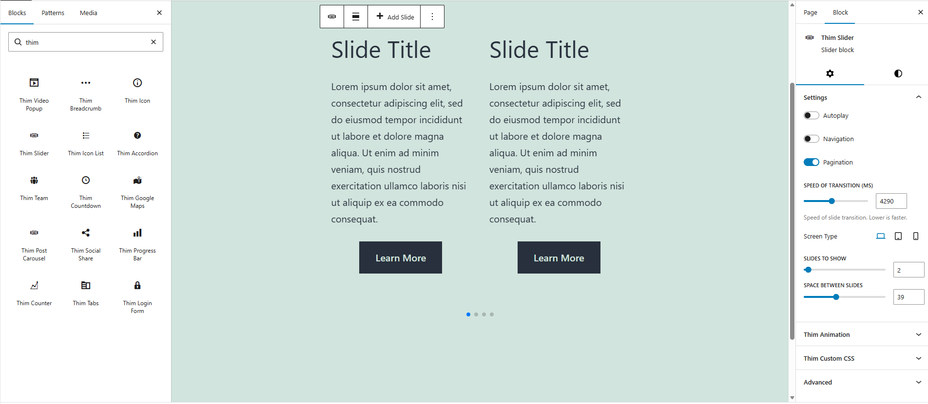
The Thim Slider Block allows you to create a responsive slider/carousel to display multiple items such as images, content blocks, or custom layouts.
Common use cases:
- Hero slider
- Testimonials
- Course highlights
- Featured posts or products
2. Access Block Settings
- Select the Thim Slider block
- Open the Block tab in the right sidebar
- Available sections:
- Settings
- Dimensions
- Thim Animation
- Thim Custom CSS
- Advanced
3. Settings
3.1. Autoplay
Automatically plays slides without user interaction.
- Enabled: slides move automatically
- Disabled: user must interact manually
Best practice:
- Enable for hero sliders
- Disable for content-heavy sliders
3.2. Navigation
Shows previous/next navigation arrows.
Use cases:
- Allow manual slide control
- Improve usability on desktop
3.3. Pagination
Displays pagination dots below the slider.
Use cases:
- Indicate total number of slides
- Allow quick navigation
3.4. Speed of Transition (ms)
Controls the transition speed between slides (in milliseconds).
- Lower value = faster transition
- Higher value = slower transition
Example:
1000→ fast3000→ smooth (default)
3.5. Screen Type (Responsive)
Allows different slider settings for:
- Desktop
- Tablet
- Mobile
Typical usage:
- More slides on desktop
- Fewer slides on mobile
3.6. Slides to Show
Defines how many slides are visible at once.
Examples:
1→ single-slide hero3→ multi-item carousel
3.7. Space Between Slides
Controls spacing (in pixels) between slides.
Best practice:
- Use larger spacing for card-style layouts
- Smaller spacing for full-width sliders
4. Dimensions
4.1. Padding
Controls inner spacing inside the slider container.
Features:
- Slider-based control
- Linked / unlinked padding
- Reset to default
Use cases:
- Add breathing room around slides
- Prevent content from touching edges
5. Thim Animation
Adds an animation effect when the slider appears on the page.
Best practice:
- Use subtle animations
- Avoid heavy effects combined with autoplay
6. Thim Custom CSS
Apply custom CSS specifically to this slider block.
Default selector:
Examples:
Change slide background:
Increase arrow size: