The Thim Icon Block allows you to display a single icon on your page.
It is commonly used to highlight information, represent features, or add visual emphasis.
Common use cases:
- Feature highlights
- Contact information
- Decorative icons
- Combined with Heading or Text blocks
1. Access Block Settings
- Click on the Thim Icon block in the editor
- Open the Block tab in the right sidebar
- You will see the following settings:
- Icon Settings
- Thim Animation
- Thim Custom CSS
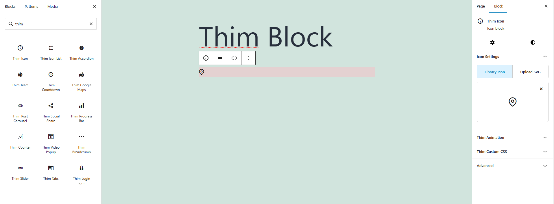
2. Icon Settings
2.1. Library Icon
Select an icon from the built-in icon library provided by the theme or plugin.
How to use:
- Click Library Icon
- Choose an icon from the list
- The icon will be displayed immediately
When to use:
- Common icons (location, phone, email, arrows)
- Consistent style with the theme
2.2. Upload SVG
Upload a custom SVG file to use your own icon design.
How to use:
- Click Upload SVG
- Select an
.svgfile from your computer - The uploaded SVG replaces the current icon
Recommended for:
- Brand icons
- Custom-designed icons
- Unique visual identity
Note:
Only upload clean and optimized SVG files without embedded scripts.
3. Thim Animation
Adds animation effects when the icon appears on the page.
Common options:
- None (default)
- Fade In
- Zoom In
- Slide Up / Down / Left / Right
(Available options depend on the theme)
Best practice:
- Use animation for landing pages or highlights
- Avoid excessive animations on one page
4. Thim Custom CSS
Allows you to add custom CSS styles specifically for this icon block.
Default structure:
selectortargets the current Thim Icon block only
Examples:
Change icon color:
Increase icon size:
Center the icon:
5. Thim Icon Block – Style & Design Options
5.1. Color
5.1.1. Text Color
Controls the color of the icon.
This option affects icon color when using icon fonts or SVG with fill: currentColor.
How to use:
- Click Text
- Choose a color from the color picker
- The icon color updates instantly
Use cases:
- Match brand colors
- Highlight important icons
- Create visual hierarchy
5.1.2. Background Color
Sets a background color behind the icon.
Best used when:
- Icon needs emphasis
- Used as feature badge
- Icon placed on light backgrounds
5.2. Typography
Note: Typography mainly applies when the icon is inline with text or inherits font settings from its container.
5.2.1. Font Style
Controls font-related styles applied to the icon container.
Available options may include:
- Font weight
- Font style (normal / italic)
- Text decoration (underline, etc.)
When to use:
- Align icon style with surrounding text
- Maintain visual consistency
5.2.2. Letter Case
Controls text transformation (if icon is used with text or pseudo-elements).
Options:
- Normal
- Uppercase
- Lowercase
- Capitalize
6. Thim Styles
6.1. Screen Type (Responsive)
Allows you to apply different styles for:
- Desktop
- Tablet
- Mobile
How to use:
- Select a screen icon
- Adjust styles for that device only
Best practice:
- Reduce padding on mobile
- Increase spacing on desktop
6.2. Font Size
Controls the size of the icon.
Options:
- Default
- Custom values (depending on theme)
Use cases:
- Large icons for hero sections
- Small icons for lists
6.3. Padding
Adds inner spacing around the icon.
Features:
- Adjustable via slider
- Reset button available
Best practice:
- Increase padding when background color is enabled
6.4. Margin
Controls outer spacing between the icon and other elements.
Use cases:
- Add space between icon and text
- Create balanced layouts
7. Practical Use Cases
- Location icon for address sections
- Phone icon in contact areas
- Feature icon above headings
- Decorative icon for visual emphasis
8. Best Practices
– Do:
- Use Library Icon for standard icons
- Use SVG for branding
- Keep icon sizes consistent
– Avoid:
- Heavy or unoptimized SVG files
- Too many animations
- Overusing custom CSS for simple icons