1. Overview
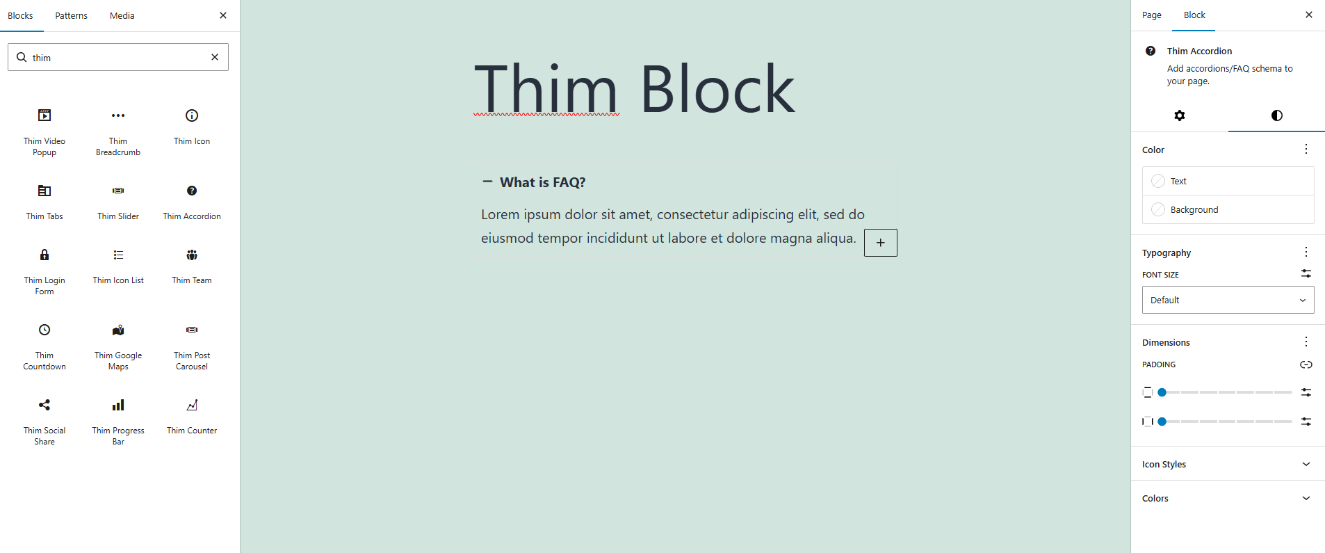
Thim Accordion Block allows you to create Accordion / FAQ sections to display collapsible content in a clean and user-friendly way.
2. Block Settings
2.1 Thim Animation
Option: Animation Type
Choose the animation effect when the accordion appears on the page.
-
None: No animation.
-
Other animations (if available): Fade, Slide, Zoom,…
Tip: Use subtle animations for better readability.
2.2 Thim Custom CSS
Add custom CSS styles specifically for this accordion block.
-
selectortargets the block wrapper. -
Styles apply only to this block.
2.3 Advanced
Advanced Gutenberg settings such as:
-
Additional CSS Class(es)
-
HTML Anchor
-
Visibility (theme-dependent)
3. Style Tab
3.1 Color
Set the text color for accordion titles and descriptions.
Set the background color of each accordion item.
3.2 Typography
Adjust the font size of accordion text.
-
Default: uses theme default
-
Responsive settings available
3.3 Dimensions
Inner spacing of each accordion item.
-
Link/unlink sides
-
Adjust padding per side
4. Icon Styles
Choose the icon position:
-
Left: Icon on the left of the title
-
Right: Icon on the right of the title
Spacing between the icon and the accordion title (in pixels).
Tip: Recommended range: 6px – 12px.
Configure icon styles per device:
-
Desktop
-
Tablet
-
Mobile
Adjust the accordion icon size.
5. Colors (Normal / Active)
5.1 Normal State
Colors when the accordion item is collapsed.
-
Title Color
-
Description Color
-
Icon Color
-
Background Color
5.2 Active State
Colors when the accordion item is expanded.
Tip: Use a slightly highlighted color for better UX.