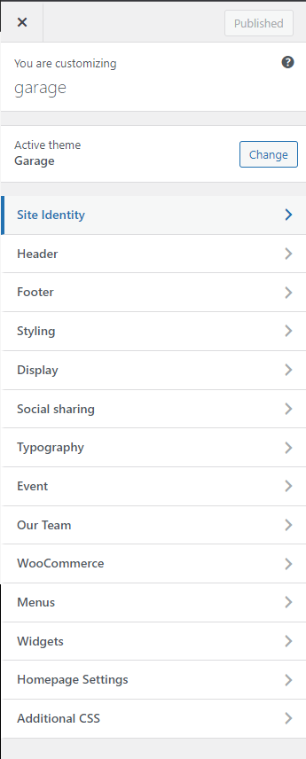
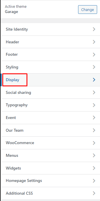
By clicking on the “Customize” menu under “Appearance”, you’ll be able to change all specific template settings
There will appear:
Please note that, after configuring something in customize, you need to click blue button <<Save & Publish>> to apply changes.
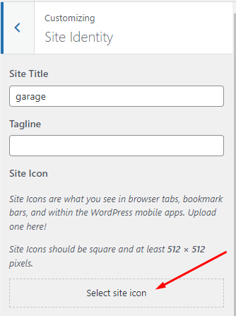
3.1.1. Site Identity:
- Enter your Site Title and Tagline
- Site Icon: which will appear on the status bar of the browser, you can upload your site icon. The site icon should be in one of the following formats: .ico, .png, .gif. Icons must be square, and at least 512px width and height. It will be shown in front-end:
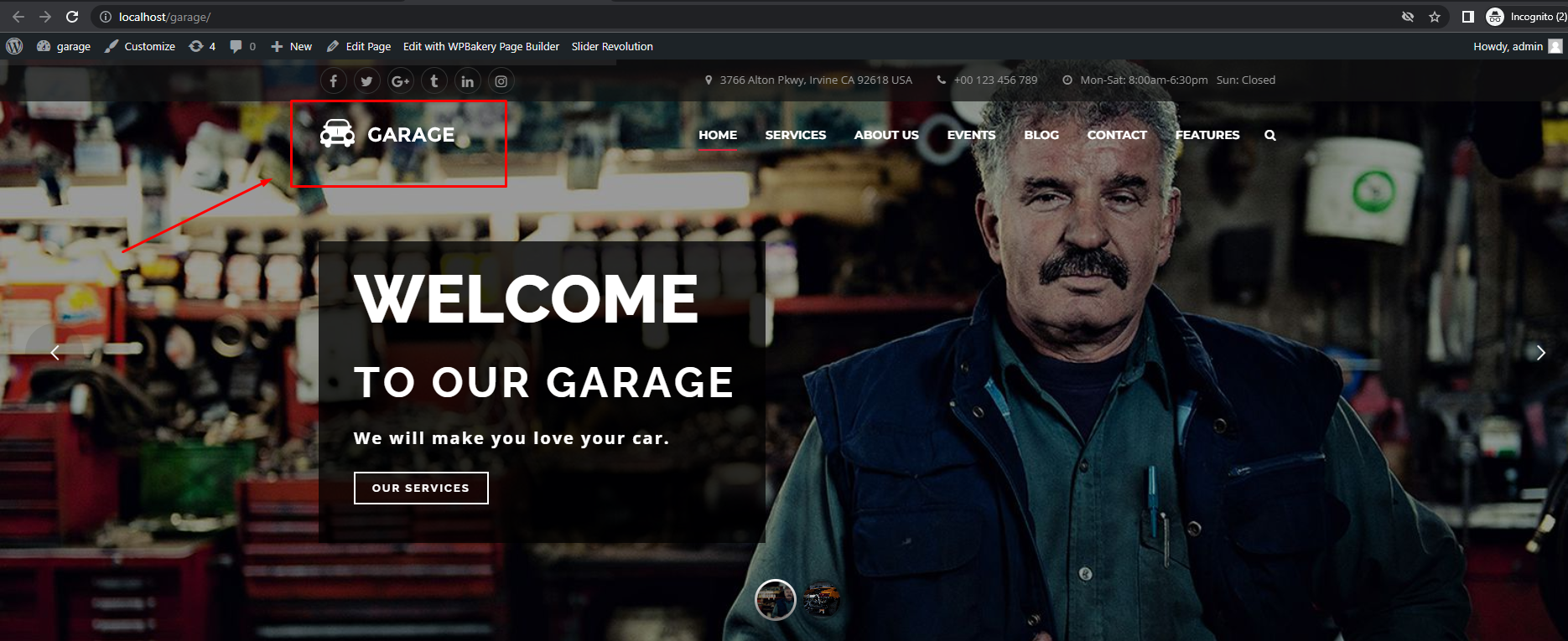
- Logo
This is the section for you to set a Logo as your website identity. You can upload this Logo on your server, or just paste an URL into the Logo box.
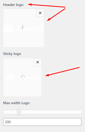
The Logo will be displayed like this on your Header and will be sticky with menu when scrolling down your site:
The size of your Logo Section on Header Menu could be set with Width Logo option. Since the layout is built using Bootstrap Grid system for a responsive design, the width of your Header Menu is also divided into 12 sections. We recommend using value 2 or 3 (corresponding with 16.67% or 25%) to menu will be shown in a line. You can set logo size as you want then your site will automatically thumbnail size depending on the value of “logo width” to logo displayed balance with menu.
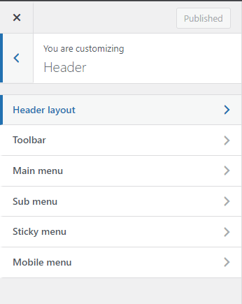
3.1.2. Header Options:
There are options to control header:
- Header Layout:
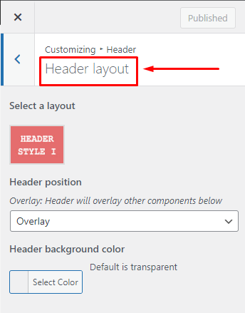
– Select a Layout: there are 2 options to select layout for header.
– Header Position: there are 2 options is Default or Overlay.
– Header Background color: select color for Header Background.
- Toolbar:
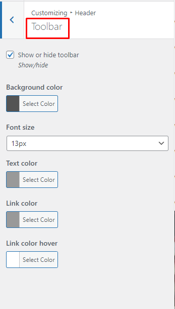
There are options to control Drawer that can be used to insert widgets at the top of your page. Note that you need to Add a Widget to show Drawer. The guideline to Add a Widget will be expressed in the Widget Section bellow.
– You can choose to Show or Hide Toolbar.
– Or select color for Toolbar Background, Text in Toolbar, Link, Link hover.
- Main Menu
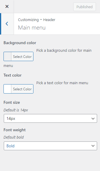
There are options help control every element on Main Menu:
– Background color: Pick a background color for the Main Menu.
– Text color: Pick a Text color for the Main Menu.
– Font Size: Select font size for Main Menu.
– Font Weight: Select font size for Main Menu.
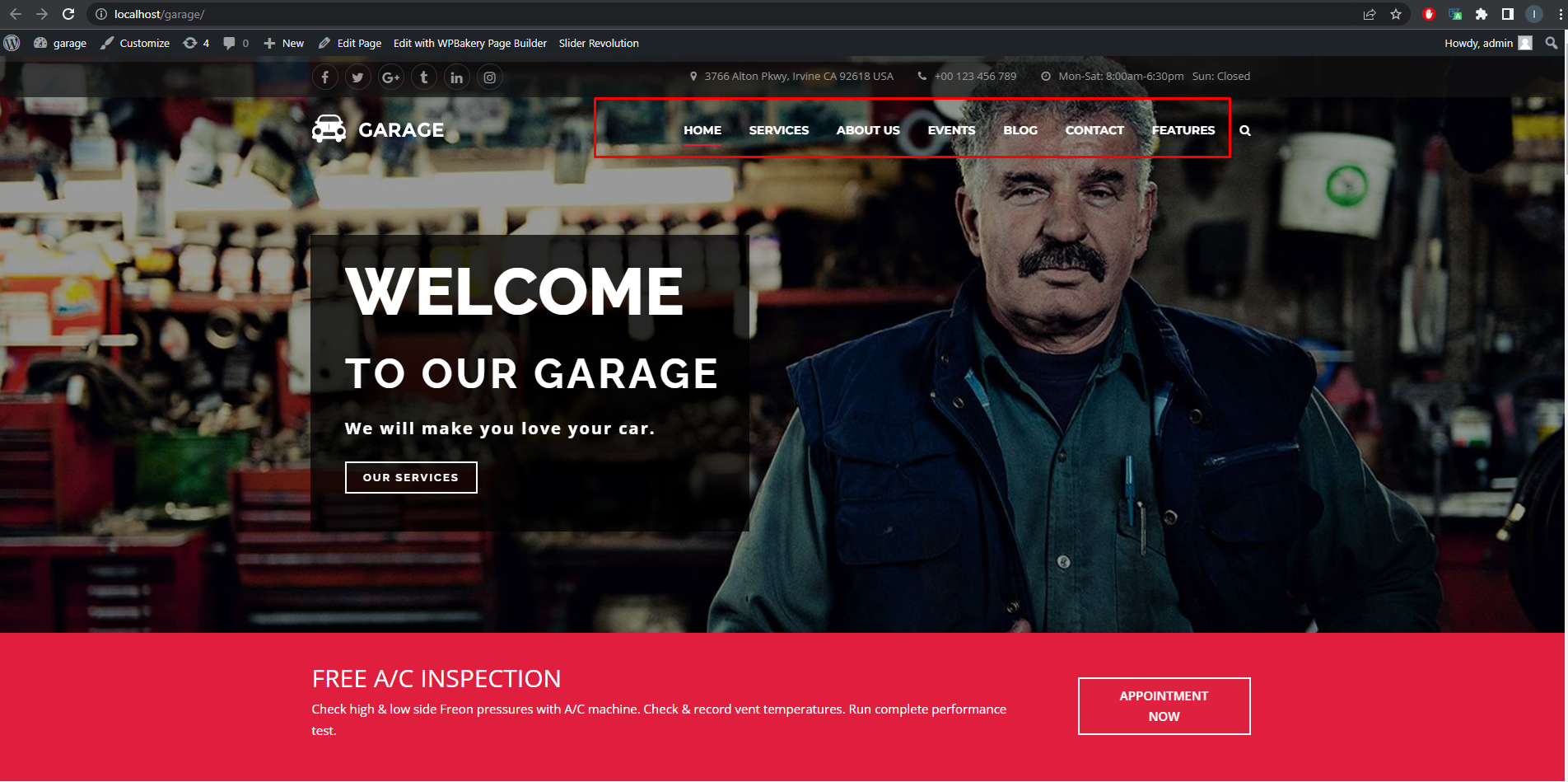
In frontend, main menu will display as below:
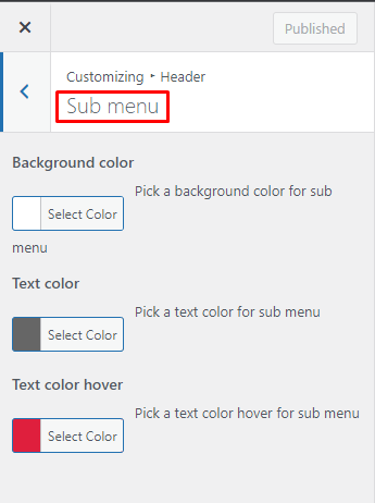
- Sub Menu
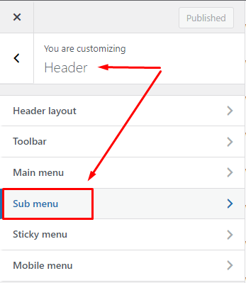
To configure for Sub Menu such as Backgound color, Text color, Text color hover.
Sub Menu is already configured and will be shown in frontend as below:
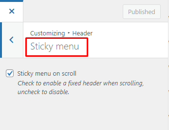
- Sticky Menu:
- Mobile Menu:
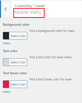
This option allows you to configure to see main menu in mobile.
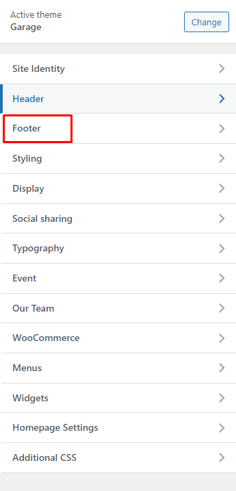
3.1.3. Footer:
Like the name indicated, it is the section to control the Footer part of your site.
- Display section:
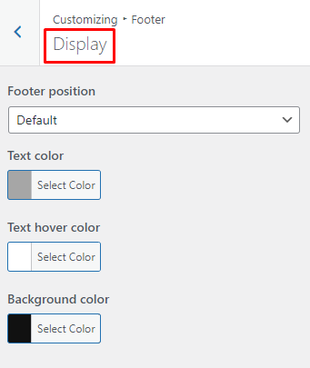
– Footer position:
– Select color for text, text hover, background of footer.
- Copyright Section:
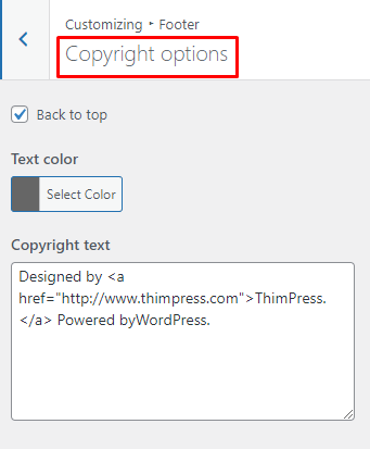
– Copyright Text: allow you to put content for the tagline in your footer.
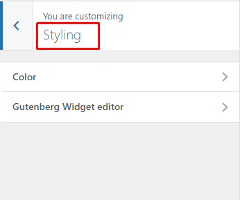
3.1.4. Styling Options
– Body Background Color: this option should only be used with the Boxed Layout. You can select a solid color for the background of your page.
– Theme Primary Color:
Each of our themes will have one major color called “Theme primary color”. The elements of the primary color are included with: Color of “Read More” button, Hover color of “All Events”, Hover color of “Back to top” button.. If you configure any color, it also will be applied similarly to these elements.
3.1. 5. Display Options
- Archive layout section:
– Select layout default:
This is the place for you to select an alignment for your frontpage, which is the first display page in your site. You can choose whether or not to use the sidebar, as well as positioning it in a layout with 1 or 2 columns.
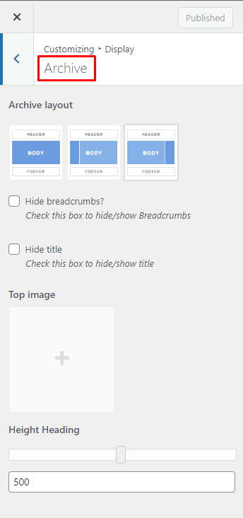
1 – No side bar at all
2 – One sidebar, located on the left
3 – One sidebar, located on the right
– Show/ Hide Breadcrumb or Tittle of Archive page.
– Top Image: select top image for front page.
- Posts And Pages Section Display
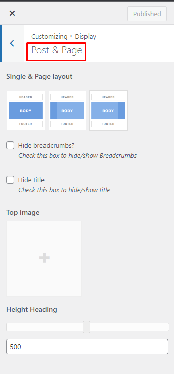
This is place to configure for all posts and pages, the same configuration as options of Archive page above.
3.1.6. Sharing:
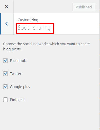
This important function is used to automatically share your blog contents on various social networks to promote your site. You can check which network should contents of your website be shared on. Just un-check all options if you don’t want to share any contents at all.
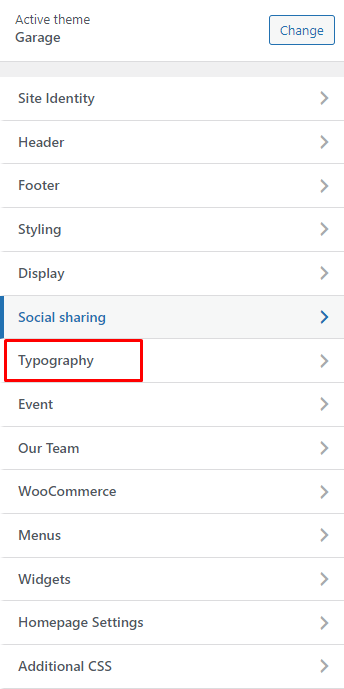
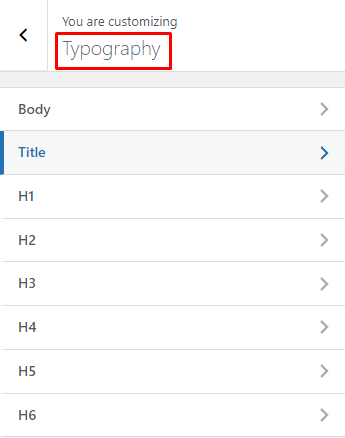
3.1.7. Typography
The Typography section gives you the control to style general text in your website. You will style the common text in your posts and pages with Body Options and Headings Options will help you style the headings in your posts.
- Body Section Option:
- Heading Section Option:
3.1.8. WooCommerce:
- Category Products
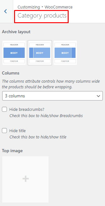
Here is place for you to configure separately for Category Products.
– Archive Layout: select a layout for your shop detail page with this option.
– You can Show or Hide Breadcrumbs or Tittle in Shop page.
– Top Image: upload image for Background Header of Shop page.
- Single Product Page
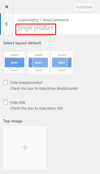
Here is where you can configure separately for Single Product.
3.1.9. Menu
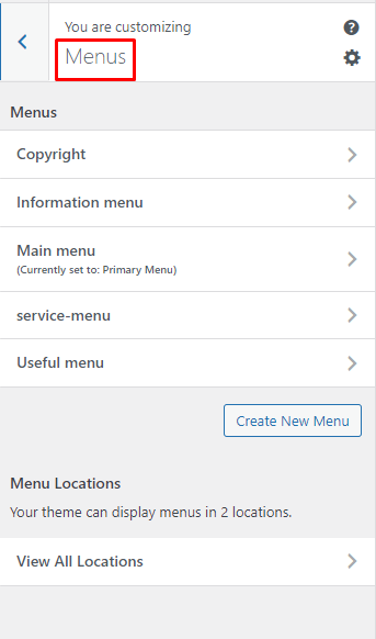
This is place to configure for menu, drag&drop menu, add a new menu…for your site.
3.1.10. Custom Css
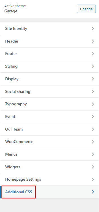
In case you want to add new CSS class to style your shop more easily, add it in this text box. This will overwrite the theme CSS, so please be careful!
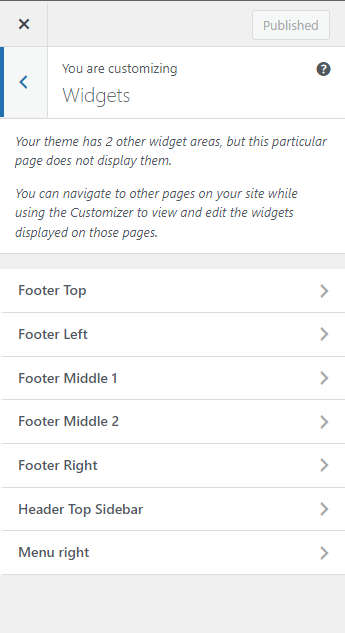
3.1.11. Widgets
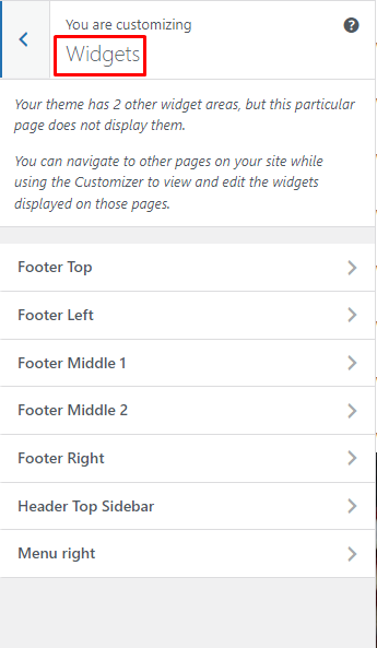
To configure to add a Widget into a Widget Area. As you can see more guideline:
To configure to add a Widget into a Widget Area. As you can see more guideline:
3.1.12. Static Frontpage
– Front page: select front page as you want.
– Posts page: select blog page as you want.
3.1.1. Import/Export Settings:
To configure options under Customize section.
If you want to have a new site with similar settings as your created site. Use this function to export a file js in created site and import this file js into the new site.