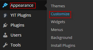
Customize
By clicking on the “Customize” menu under “Appearance”, you’ll be able to change all specific template settings.
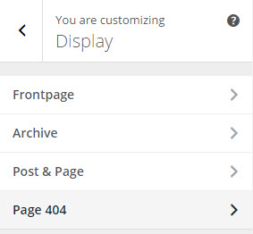
There will appear:
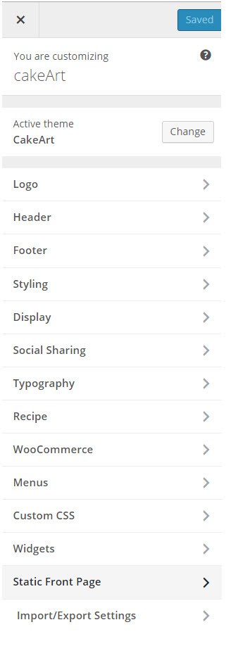
Please note that, after configuring something in customize, you need to click blue button <<Save & Publish>> to apply changes.
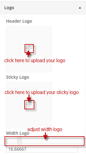
1. Logo:
This is the section for you to set a Logo as your website identity. You can upload this Logo on your server, or just paste an URL into the Logo box.
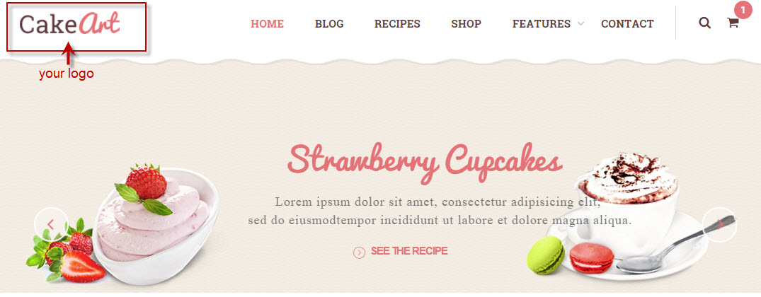
The Logo will be displayed like this on your Header and will be sticky with menu when scrolling down your site:
The size of your Logo Section on Header Menu could be set with Width Logo option. Since the layout is built using Bootstrap Grid system for a responsive design, the width of your Header Menu is also divided into 12 sections. We recommend using value 2 or 3 (corresponding with 16.67% or 25%) to menu will be shown in a line. You can set logo size as you want then your site will automatically thumbnail size depending on the value of “logo width” to logo displayed balance with menu.
Favicon:
Similarly, the image indicated by the Favicon box will be your site logo favicon, which will appear on the status bar of the browser.
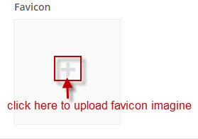
The favicon should be in one of the following formats: .ico, .png, .gif. Usually we should use .ico.
It will be shown in frontend:

2. Header Options:
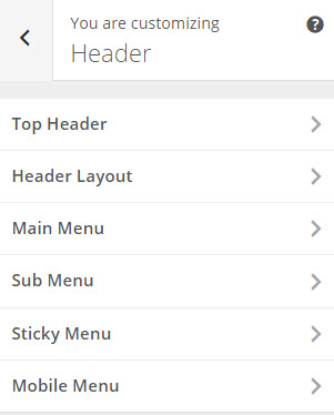
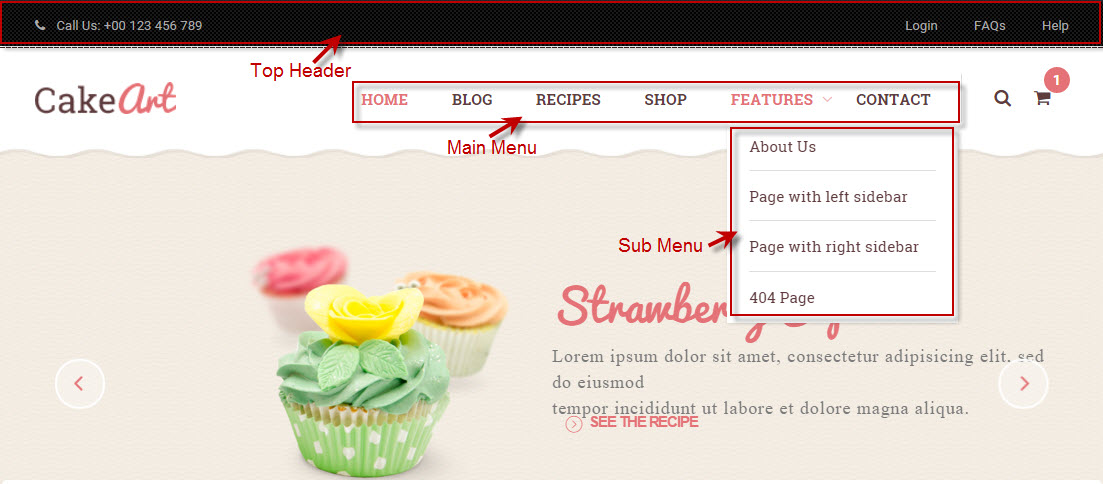
- Top Header
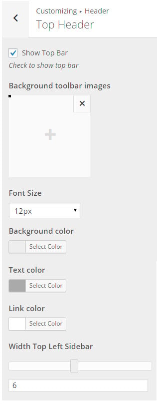
– Show Top Bar: check on to show Tool Bar of un-check if you don’t want to show.
– Background toolbar images: click on “+” symbol to upload background image for tool bar.
– Font Size: select font size for text of tool bar.
– Background color: you can select background color instead of background image for tool bar.
– Text color: select color for text of tool bar.
– Link color: select color for text of tool bar when hover mouse on text.
– Width Top Left Sidebar: adjust width of top tool bar on the left, the rest of width tool bar will be remain width.
- Header Layout
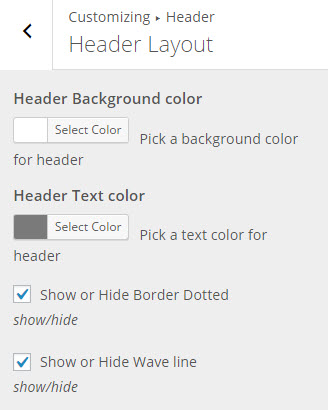
– Header Background color: select color for Header Background.
– Header Text color: select color for Header Text.
– You also can check on or un-check to show or hide Border Dotted on the top header and Wave line on the bottom header.
- Main Menu:
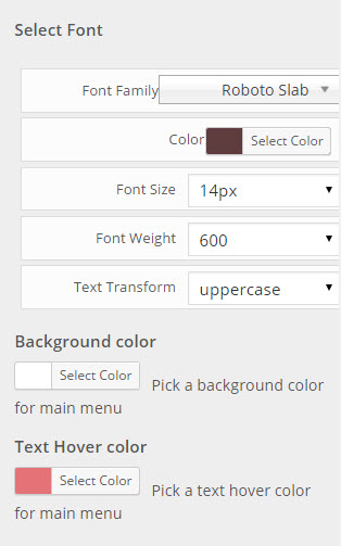
This is place to configure Font text, background color and text hover color for Main Menu.
- Sub Menu:
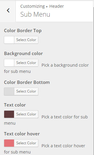
There are options to configure for Sub Menu: Color Border Top, Background color, Color Border Bottom, Text color, Text color hover.
- Sticky Menu:
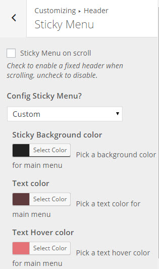
– Sticky Menu on scroll: Check to enable a fixed header when scrolling, un-check to disable.
– Config Sticky Menu? How Header appear when sticky menu, select “Same with Main Menu” to be default Header or select “Custom” to change Sticky Background color, Text color, Text Hover color.
- Mobile Menu:
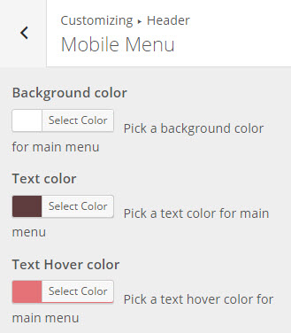
This is a place to configure Menu on mobile.
The header will be displayed in front-end:
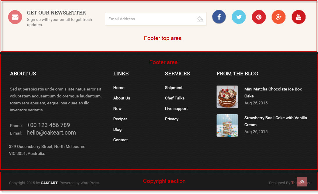
3. Footer Options
Like the name indicated, it is the section to control the Footer part of your site.
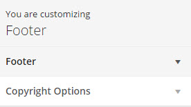
- Footer:
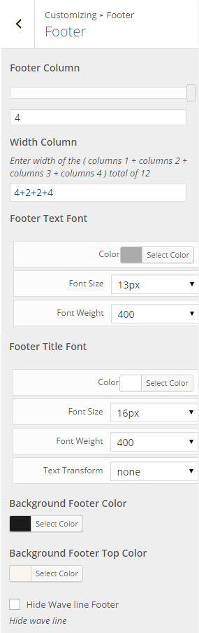
– Footer Column: configure number column for footer.
– Width Column: Enter width of the ( columns 1 + columns 2 + columns 3 + columns 4 ) total of 12
– Footer Text Font: select font text of footer.
– Footer Title Font: select font tittle of footer.
– Background Footer Color: Select Background color for Footer.
– Background Footer Top Color: configure background color for footer top.
- Copyright Options
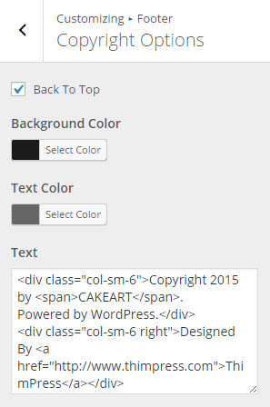
– Background Copyright Color: select color for background copyright.
– Text Color: Select color for text in copyright.
– Copyright Text: allow you to input content for the tagline in your footer.
In front-end, footer area will be shown:
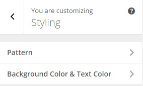
4. Styling Options
- Patterns Section Option:
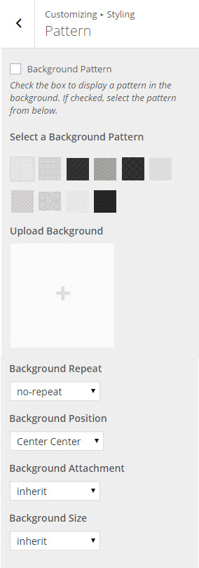
– Background Pattern: checking the box under this option title and you will be able to select one of ours.
– Upload Background: select background to upload to use as your Background Pattern.
– Background Repeat: to repeat the image in your background.
– Background Position: to set the starting position of a background image.
– Background Attachment: to set whether a background image is fixed/scroll/local/ initial or inherit with the rest of the page.
– Background Size: to specify the size of the background images.
- Background Color & Text Color
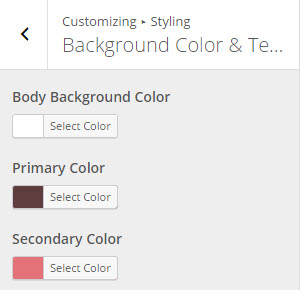
– Body Background Color: this option should only be used with the Boxed Layout. You can select a solid color for the background of your page.
– Theme Primary Color:
Each of our themes will have one major color called “Theme primary color”. The elements of the primary color are included with: Hover Icon color of “Search”, “Account”, “Wishlist” “Cart”; Hover Background Product color; Hover social link color, Hover Custom Menu color… If you configure any color, it also will be applied similarly to these elements.
– Theme Second Color:
This is color of Background “Add to cart” button, Heading Tittle of “Posts Display”,… Theme second color will be shown to above elements, if you configure it.
- RTL Support:
You can check on RTL to enable support RTL language.
5. Display
- Front page:
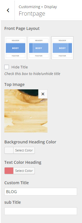
– Front Page Layout:
This is the place for you to select an alignment for your frontpages, which is the first display page in your site. You can choose whether or not to use the sidebar, as well as positioning it in a layout with 1 or 2 columns.
1 – No sidebar at all
2 – One sidebar, located on the left
3 – One sidebar, located on the right
– Top Image: upload top image for front page.
– Background Heading Color: If you do not want to show background image, you can select heading color.
– Text Color Heading: select color for text heading.
– Custom Title: enter name of Tittle archive page. If leave blank field, system will automatically display name of archive page.
– Sub Title: enter name of sub Tittle archive page. If leave blank field, system will automatically display name of archive page.
- Archive:
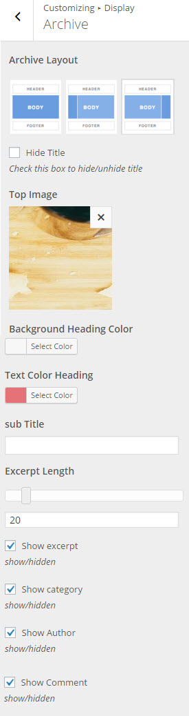
This is the place for you to select an alignment for your archive pages. You can choose whether or not to use the sidebar, as well as positioning it in a layout with 1 or 2 columns.
1 – No side bar at all
2 – One sidebar, located on the left
3 – One sidebar, located on the right
– Show/ Hide Breadcrumb or Tittle: select show or hide tittle or breadcrumbs.
–
– Top Image: upload top image for Archive page.
– Background Heading Color: select background heading color to show instead of background image.
– Text Color Heading: text color heading in archive page.
– Sub Title: enter sub tittle for archive page or leave blank.
– Excerpt Length: the number words of posts displayed in archive and front page if select summary type.
– Show/Hide category, date, author comment, avata, tags of posts in archive and front page.
- Post & Page:
Options for configuration of Posts & Pages is similar with Archive page.
- Page 404
- This is place to configure for page that visitor can not found any page on the site.
6. Social Sharing
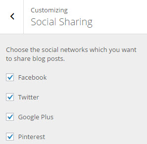
This important function is used to automatically share your blog contents on various social networks to promote your site. You can check which network should contents of your website be shared on. Just uncheck all options if you don’t want to share any contents at all.
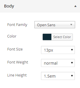
7. Typography
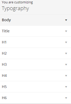
The Typography section gives you the control to style general text in your website. You will style the common text in your posts and pages with Body Options, Tittle.
Headings Options will help you style the headings in your posts.
- Body Section Option:
- Tittle Section Option:
- Heading Section Option:
8. Recipe
Recipe is a post type, you can configure for Category Recipe and Recipe Page same with post and archive page.
- Category Recipe:
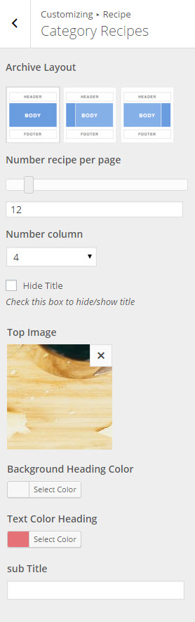
This is place to configure for category recipe page.
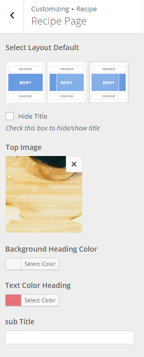
- Recipe page:
9. WooCommerce
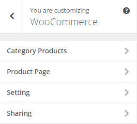
- Category Products
Here is place for you to configure separately for Category Products.
– Archive Layout: select a layout for your shop detail page with this option.
– You can Show or Hide Breadcrumbs in Shop page.
– Background Heading: select Background Image or Background Color.
– Text color Heading: select color for text heading.
– Sub Tittle: enter sub tittle for shop page or leave blank.
-
- Product PageYou also can configure separately for Single Product here.Other options for setting the single product are similarly described in the Category Product Section.
- Setting:You can do setting of other options for single product page and categories product page here.– Color Price: select color for price of product.– Column: select number column show product on archive shop page.– Number of Products per Page: enter number products shown on shop page.– Show/ Hide Quickview in products list.
- Sharing
Check on box if you want to share shop page on social link.
10. Menu
This is place to add Menu Item for Main Menu or Footer Menu.
11. Custom CSS
In case you want to add new CSS class to style your shop more easily, add it in this text box. This will overwrite the theme CSS, so please be careful!
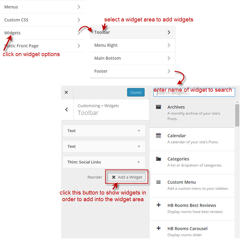
12. Widgets
To Add a Widget for one Widget Area:
13. Static Frontpage
This is place that you can set a static front page.
– Front page: select front page as you want.
– Posts page: select blog page as you want.
14. Import/ Export Setting
To configure options under Customize section.
If you want to have a new site with similar settings as your created site. Use this function to export a file js in created site and import this file js into the new site.
WooCommerce Settings
Inside this panel you will find all core WooCommerce settings such as: catalog settings, pages, payment gateways, shipping methods and tax rates which are accessible via the tabs at the top of the screen.
To configure your shop go to “WooCommerce > Settings”, then browse through the tabs below to get more information on the WooCommerce Options and then click Save changes.
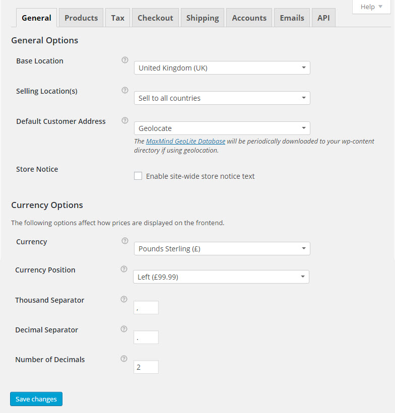
For more details, please follow the official docs.
Product Thumbnail Settings
The Product thumbnail size is decided by Product Image settings in WooCommerce. To customize, open WooCommerce Settings menu, then switch to the “Products” >> “Display” >> “Product Image Sizes”
If you change these options after the images are set for your product, please re-generate your thumbnails to match the new settings by accessing the Tools >> Regen. Thumbnails menu and click on the <<Regenerate All Thumbnails>> button.