The Thim Progress Bar block is used to visually represent progress, completion percentage, or skill levels in a clean and intuitive way.
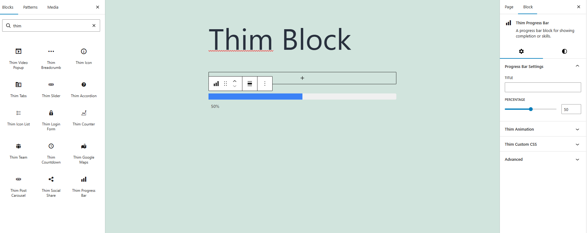
1. Progress Bar Settings
1.1 Title
Enter a title for the progress bar.
This text usually describes the skill, task, or metric being represented.
1.2 Percentage
Set the progress value as a percentage.
The value ranges from 0 to 100 and determines how much of the bar is filled.
2. Dimensions
2.1 Padding
Adjust the inner spacing of the progress bar block.
Padding can be customized to create more space around the bar for better layout control.
3. Title and Percentage
3.1 Title Style
Choose how the title is displayed relative to the progress bar.
Available options:
-
Outside – Displays the title outside the bar.
-
Inside – Displays the title inside the bar.
3.2 Percentage Style
Choose how the percentage value is displayed.
Available options:
-
Outside – Shows the percentage outside the bar.
-
Inside – Shows the percentage inside the bar.
3.3 Track Height (PX)
Set the height of the progress bar track in pixels.
Increasing this value makes the bar thicker.
4. Colors
4.1 Title Color
Change the color of the progress bar title text.
4.2 Track Color
Set the background color of the progress bar track (the unfilled part).
4.3 Fill Color
Set the color of the filled portion of the progress bar.
4.4 Percent Color
Change the color of the percentage text.
5. Thim Animation
Configure animation effects for the progress bar when it appears on the page.
This helps create a more dynamic and engaging visual experience.
6. Thim Custom CSS
Add custom CSS to style the progress bar block.
Use the selector keyword to target this block specifically.
7. Advanced
Advanced configuration options for developers, including additional layout and block-level settings.