1. Overview
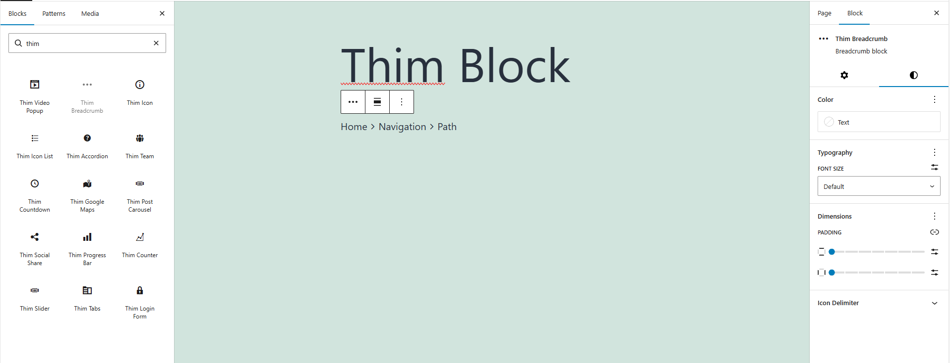
The Thim Breadcrumb Block displays a breadcrumb navigation trail, helping users understand their current location and navigate back to previous pages.
Common use cases:
- Blog posts
- Course pages
- Category / archive pages
- Product pages
2. Access Block Settings
- Select the Thim Breadcrumb block
- Open the Block tab in the right sidebar
- Available sections:
- Color
- Typography
- Dimensions
- Icon Delimiter
- Thim Animation
- Thim Custom CSS
- Advanced
3. Color
3.1. Text Color
Controls the color of breadcrumb text links.
Use cases:
- Match site color scheme
- Improve contrast on different backgrounds
4. Typography
4.1. Font Size
Adjusts the font size of breadcrumb items.
Options:
- Default (theme-defined)
- Custom size (if supported)
Best practice:
- Use smaller font sizes than page titles
- Ensure readability on mobile
5. Padding
Controls the inner spacing of the breadcrumb container.
Features:
- Slider-based control
- Linked/unlinked padding
- Reset to default
Use cases:
- Add spacing above/below breadcrumb
- Improve visual separation
6. Icon Delimiter
Delimiter is the icon or symbol separating breadcrumb items
6.1. Delimiter Color
Sets the color of the breadcrumb separator icon or symbol.
Tips:
- Use a lighter color than text
- Avoid drawing too much attention
6.2. Screen Type (Responsive)
Customize delimiter styles for:
- Desktop
- Tablet
- Mobile
Use cases:
- Smaller delimiter on mobile
- Adjust spacing on small screens
6.3. Font Size (Delimiter)
Controls the size of the delimiter icon or symbol.
6.4. Padding (Delimiter)
Adds spacing around the delimiter to improve readability.
Best practice:
- Keep enough spacing so breadcrumb doesn’t look crowded
7. Thim Animation
Adds an animation effect when the breadcrumb appears.
Options:
- None (default)
- Fade In
- Slide
- Other effects (theme-dependent)
Best practice:
- Use subtle animation
- Breadcrumbs should not distract users
8. Thim Custom CSS
Apply custom CSS specifically to this breadcrumb block.
Default selector:
Examples:
Change link hover color:
Add underline to active item: