The product page is a crucial part of a website, where customers can discover what a business has to offer.
A product page that is well-crafted will make it easy for customers to access the information they want, which will increase the chances that they will buy something. 
On the product page, customers can find out everything they need to know about the product. It shows them the product’s features, benefits, and price, which will help them make a buying decision. The product page is designed to present this information in a simple and clear way.
To make your product page attractive and functional, these are the settings you need to adjust:
- Breadcrumbs
- Title
- Price
- Star rating
- Countdown timer
- Stock countdown
- Description
- Product meta
- Fake review
- Border
- Variant picker
- Size chart
- Quantity selector
- Buy buttons
- Share & Wishlist, Compare
- Border
- Icon with text
- Trust badge
- Product information tabs
- Relate products
- Recently product
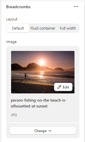
Breadcrumbs: In this section you can edit layout, image, color, text alignment, and padding.
Compare the differences among the three layout styles:
Default
Fluid container
Full width
You can upload an image to display the product above the breadcrumbs.
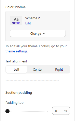
You can select a color scheme from the available options by clicking on “change” or go to theme settings to add your own color.
You can adjust how the breadcrumb text looks by changing the text alignment.
Left
Center
Right
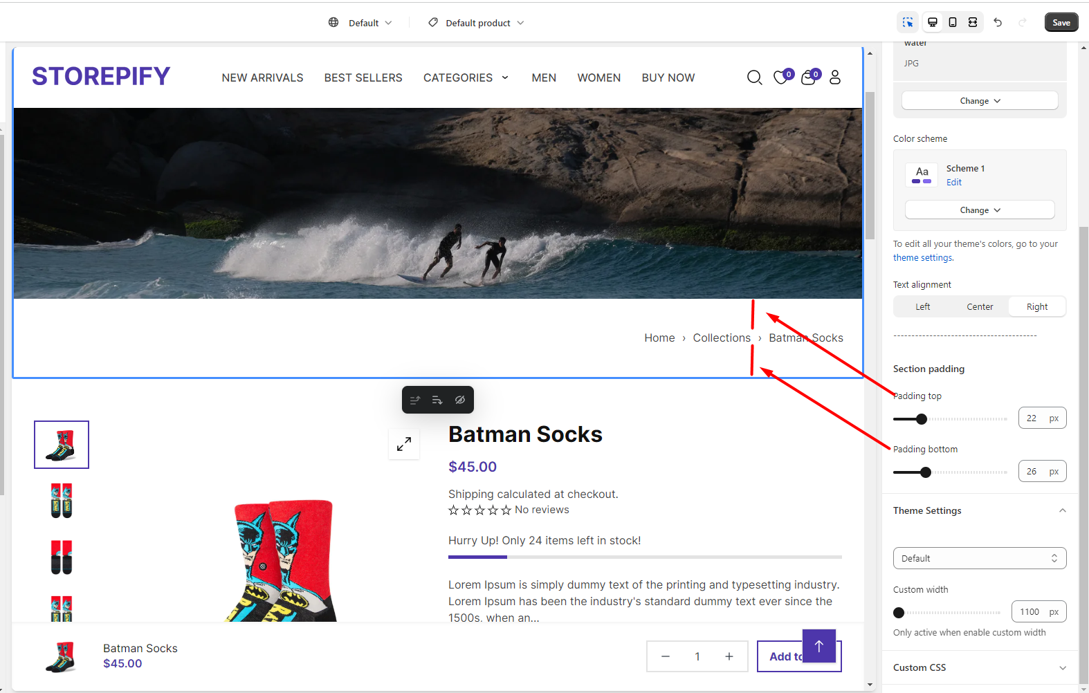
You can change the amount of space above and below the text by editing the top and bottom padding.
Product information:
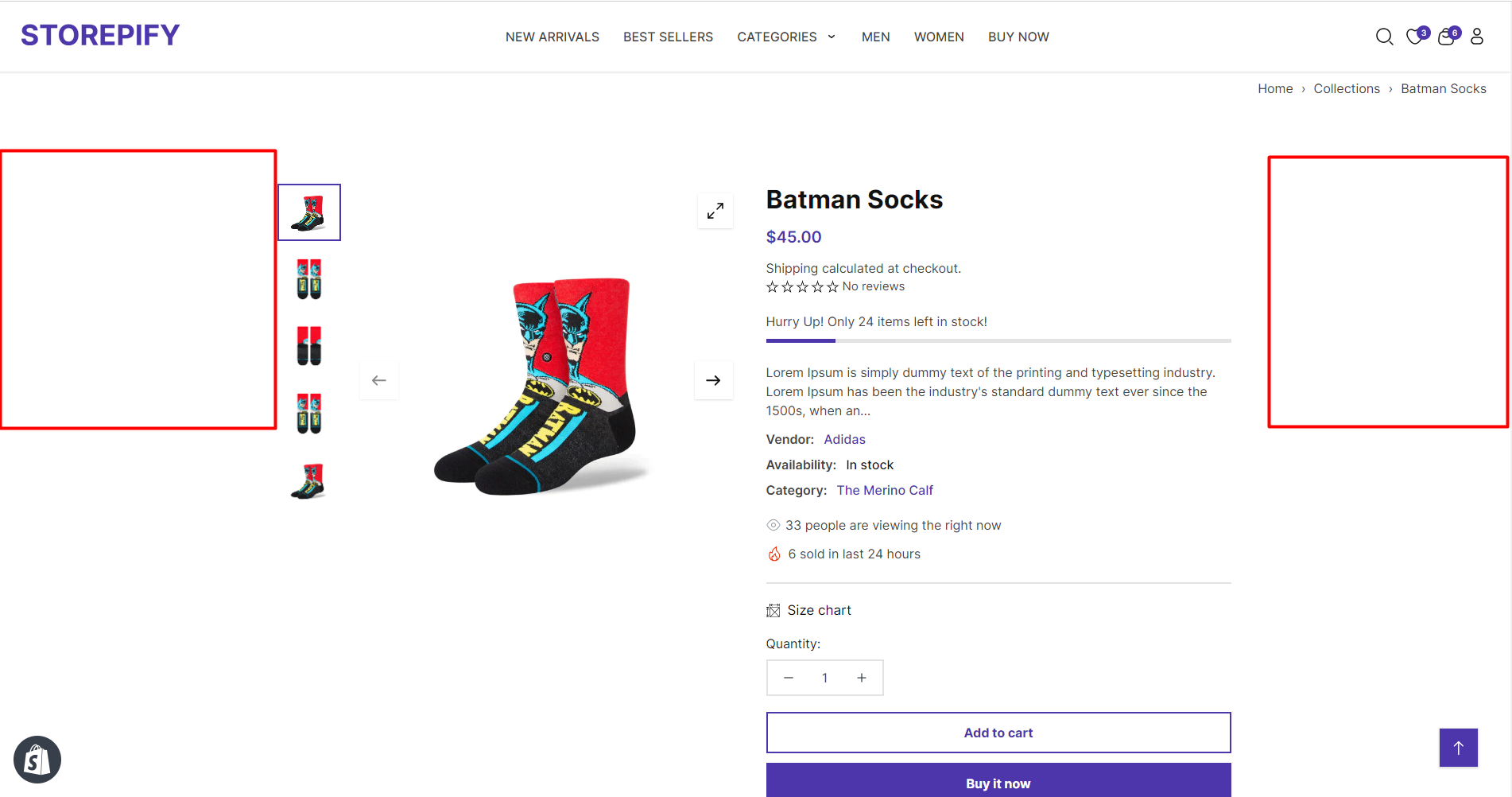
You can modify how the product information block looks by changing its layout.
Default
Fluid container
Full width
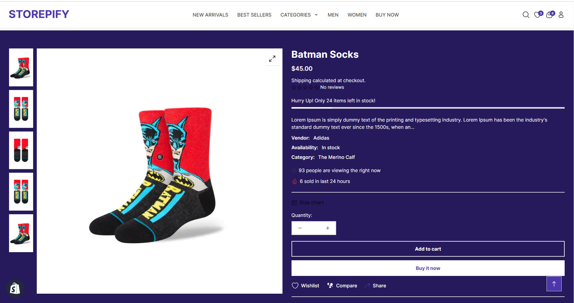
You can choose different colors for each block.
Sticky content lets you fix the image on the desktop. This means the image won’t move with the rest of the web page when you check the product details.
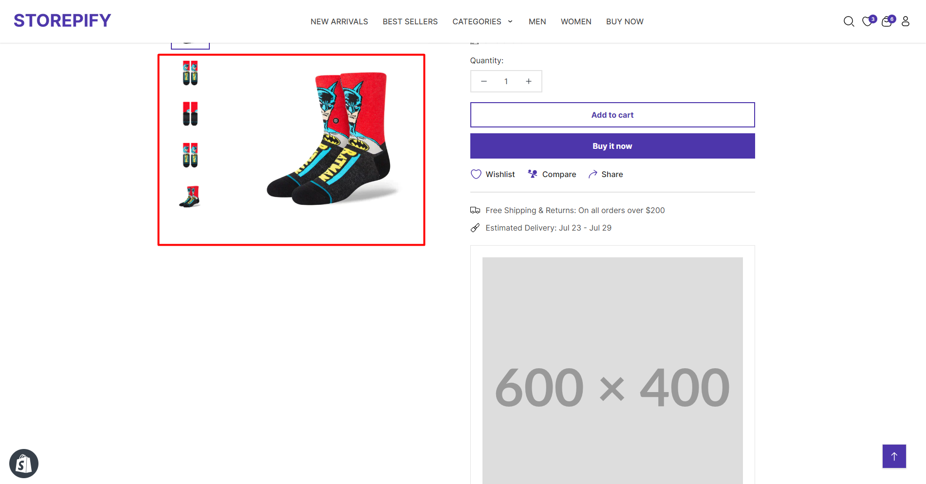
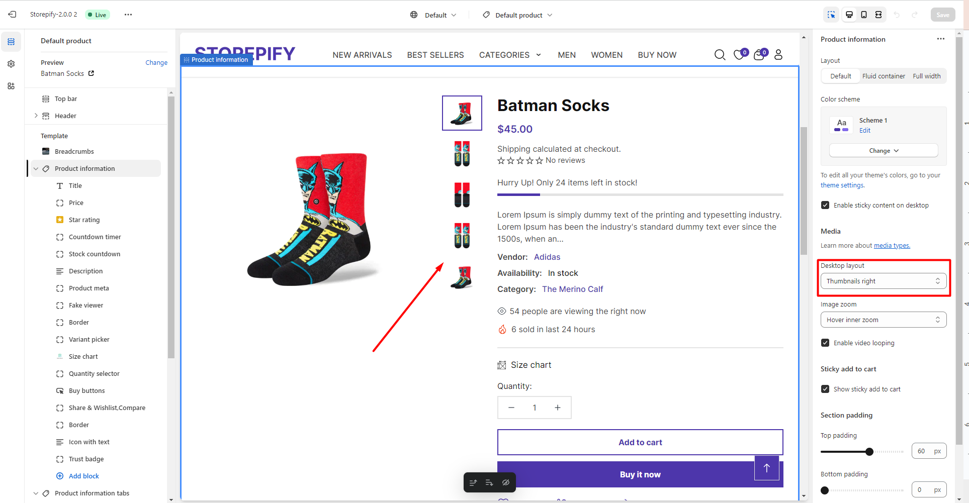
Desktop layout: Choose to display product thumbnail picture style.
You can also select other styles such as thumbnails at the bottom, no thumbnails, grid with one column, or grid with multiple columns.
Image zoom: Pick a style to decide how the product image will look when you hover over it.
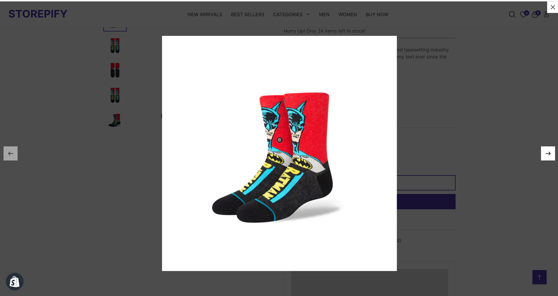
Open lightbox: When you click on the product image, it will open a lightbox to show a larger view.
Hover inner zoom: Click on the image once to make it bigger.
The following are the subsections for the product information:
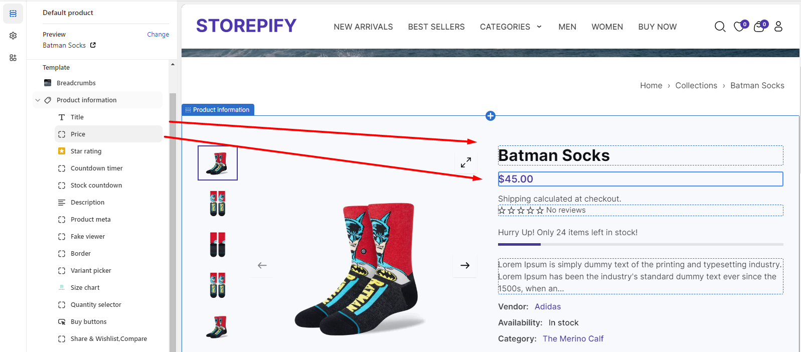
The title and price are specific to each product, so you cannot edit them.
You can change how the star rating looks by editing the size of the stars, the alignment of the text, the product name, and the message that appears when there are no reviews.
Stock countdown: You can show how many products are left by displaying the stock countdown.
Product meta: You can choose to display the vendor name, the availability status, and the category name in the product meta section.
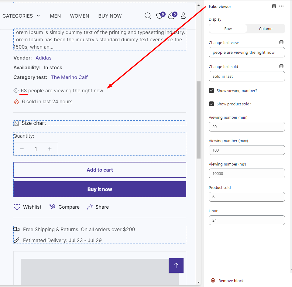
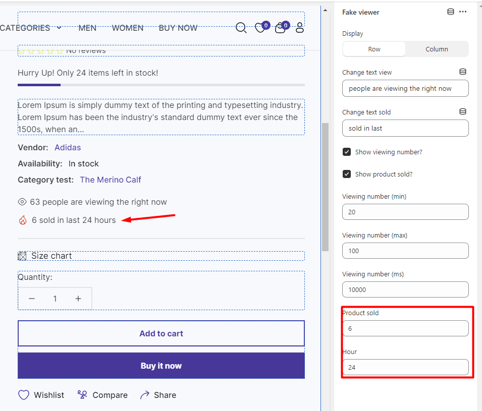
Fake viewer: To create more virtual engagement for your products, you can show how many views and purchases they have.
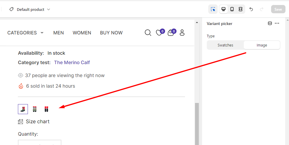
Variant picker
You can choose between two types of variant displays: swatches or images.
Buy buttons: To make users agree to the terms before they buy a product, you can turn on the “Confirm terms” option.
Share & wishlist, compare: You can display the icons for sharing, adding to wishlist, and comparing products below the “Buy It Now” button.
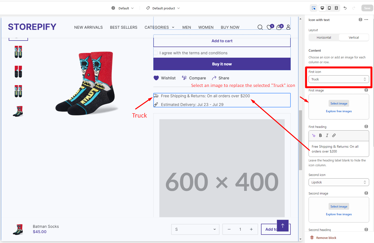
Icon with text: Let your customers know how you deliver your products with this advertisement.
You can change how the layout and content look, including the first icon, the first image, and the first heading.
You have two options for how to display the layout: Horizontal or Vertical.
Horizontal
Vertical
Trust badge: Show the buyers that your product is reliable by adding images of the relevant brands or banks here.
Product information tabs
These are the areas of the product information tabs that you can edit: description, custom tab, shipping & return, and review.
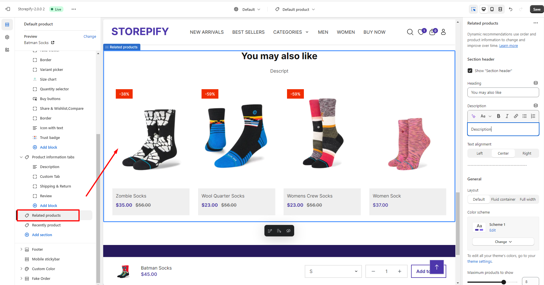
Related products provide more information and alternatives for customers who are shopping. This can improve their shopping experience and make them more content.


